I'll be honest—when I first saw Cracker Barrel's new logo, my immediate thought was: "Wait, is this a honey startup? Or some company that makes barrels?"
The old logo had soul. Something personal. You looked at it and immediately felt the story.
The new one? It looks like every other logo. Generic. Forgettable. The kind of thing a design agency churns out in 20 minutes when they're thinking about billboards instead of brand equity.
And apparently, I wasn't alone. After unveiling their new logo on August 19, 2025, Cracker Barrel's stock dropped 12% (that's nearly $100 million in market value), customers went ballistic on social media, and even Trump weighed in.
One week later—ONE WEEK—they reversed it and went back to the old logo.
Let me break down what went wrong, what they should've done, and what your brand needs to learn from this $700 million disaster.
The Old Cracker Barrel Logo: What Actually Worked
Let's start with what they had for 48 years.
The original logo featured "Uncle Herschel"—an old-timer in overalls sitting in a wooden chair, leaning against a barrel. Gold and brown tones. The "Old Country Store" tagline underneath. Simple, but packed with personality.
Why It Lasted Nearly Five Decades
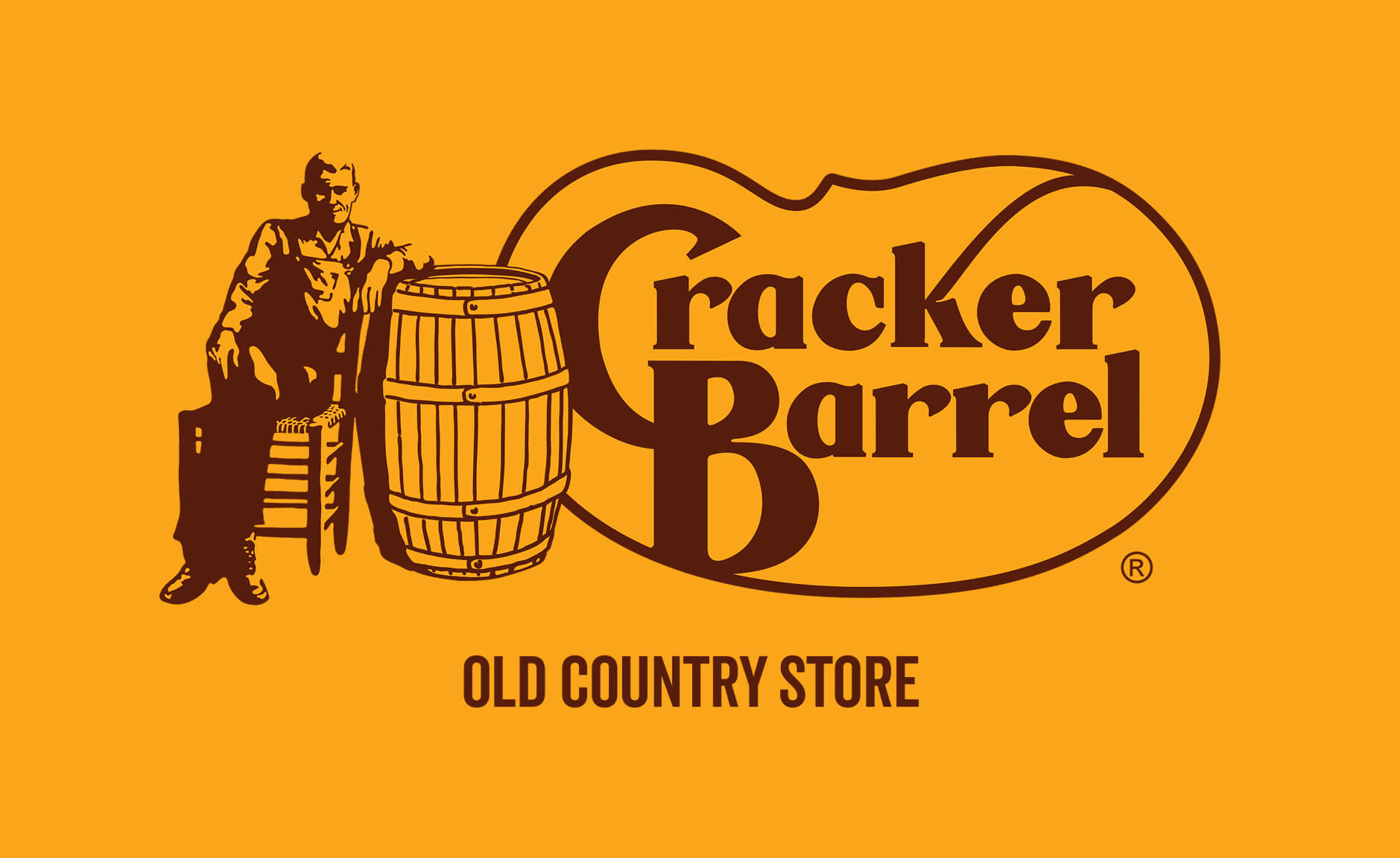
The generation grew up with it. People get used to things. That logo was on highway signs, restaurant fronts, and menus for nearly half a century. It became part of the American roadside landscape.
It doesn't even look bad today. Think about that—a logo designed in the 1970s still holds up in 2025. That means back in the 70s, it was actually upscale. The colors work. The composition is solid. It's distinctive.
It had built-in brand equity worth millions. When you saw that old man leaning against the barrel, you knew exactly what you were getting: comfort food, Southern hospitality, nostalgia. The logo did its job perfectly.
Nashville designer Bill Holley sketched it on a napkin in 1977. No fancy agency presentations. No focus groups. Just a simple idea that worked: "Let's create a feeling of nostalgia with an old-timer wearing overalls."
And it worked for 48 years.
The New Cracker Barrel Logo: What the Hell Happened?
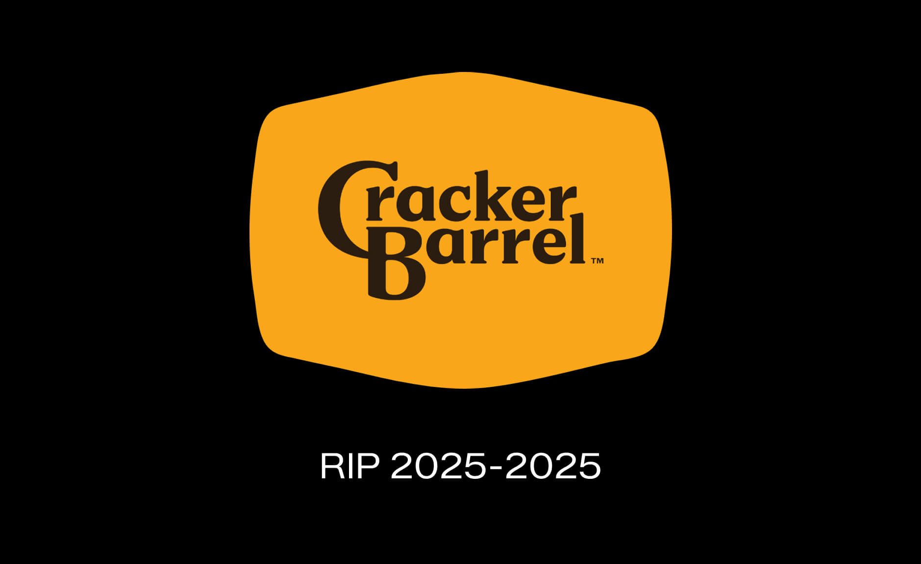
On August 19, 2025, Cracker Barrel unveiled their new look as part of a $700 million "strategic transformation."
Out went Uncle Herschel. Out went the barrel. Out went the personality.
In came... text. Just the words "Cracker Barrel" on a vague yellow blob that's supposed to suggest a barrel shape.
They kept the gold and brown colors (smart), updated the typeface to something "modern" (unnecessary), and called it a day.
The CEO's Excuse: "Highway Visibility"
According to the CEO, the rebrand was about making the logo "easier to read on billboards."
Let me call BS on that right now.
People already recognize Cracker Barrel from the colors and shape. You don't need more visibility when you're a brand with 660 locations and $3.5 billion in annual revenue.
And here's the kicker: the dimensions of the text and foreground are basically the same. The font is almost identical. These "small fixes" don't make a big difference for the average person driving 70 mph on the highway.
You know what DOES make a difference? Having a distinctive icon that people remember.
What They Got Right
Honestly? They kept the yellow. That's about it.
The gold yellow tones are still recognizable. If they'd changed it, it would've been a complete disaster instead of just a massive one.
Well, regarding the black - open questions. Ain't that one a bit Amazon'ish?…
Where They Completely Missed the Mark
They removed Uncle Herschel. The logo lost its soul.
That's the entire problem in one sentence.
You can't take a 50-year-old brand with a beloved character and just... delete him. That's not modernization. That's brand suicide.
The new logo looks like it could be:
A startup making artisanal barrels
A honey brand
A generic restaurant chain
Literally anything except Cracker Barrel
It has no story. A heritage brand's logo should have a story. A startup logo has a seed round and a PR release. That's the difference.
When you remove the one element that makes your brand human and recognizable, you're not evolving—you're erasing.
The Real Issue: They Killed the Symbol
Look, I get it. Sales were down. Their "traditionalist" customers (65+) weren't coming back post-COVID. They needed to attract younger, more affluent customers. The company wasn't leading in any area, according to their own CEO.
But here's what they didn't understand: the solution to declining relevance isn't to become more generic.
If your brand is losing relevance, you don't fix it by looking like everyone else. You fix it by doubling down on what makes you unique—and then bringing that story into 2025 in a way that feels fresh, not corporate.
What DTC Brands Can Learn from This Rebrand
Here's what I tell my clients when they're thinking about rebranding—and what Cracker Barrel should've heard before they spent $700 million.
Lesson #1: Don't Destroy the History—Story is What Makes You Unique
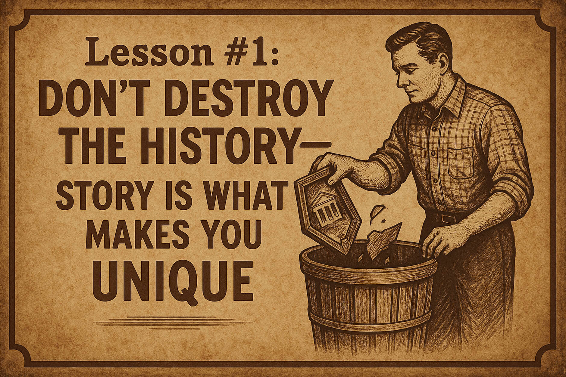
In these fast times, where every brand can source the same products, use the same Shopify themes, and run the same Meta ads, story is your only real differentiator.
Cracker Barrel had 50+ years of story baked into that logo. Uncle Herschel wasn't just a character—he represented something bigger. Roadside hospitality. Southern comfort. Simpler times.
When you have that kind of brand equity, you don't throw it away because some consultant told you millennials prefer "clean, modern design."
I've seen DTC brands doing $500K-$1M try to rebrand every year because they think their logo "looks dated." Meanwhile, their actual problem is positioning, messaging, or product-market fit—not the damn logo.
The principle: Heritage is an asset, not a liability. If you've built recognition, protect it.
Lesson #2: Modernization is Fine—But Not Killing
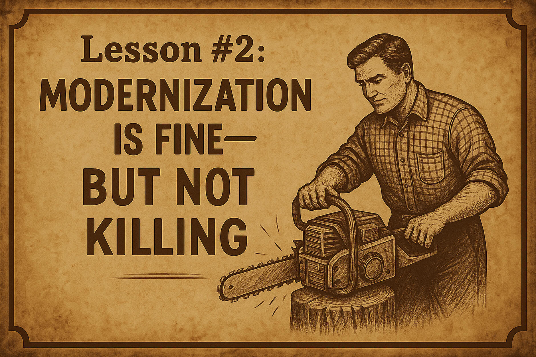
There's a difference between evolution and erasure.
Evolution: You update Uncle Herschel. Make the illustration cleaner. Modernize the colors slightly. Create animation versions for digital. Make the character feel more alive.
Erasure: You delete Uncle Herschel entirely and replace him with text.
Cracker Barrel chose erasure. That's why they failed.
When I work with brands on refreshes, we look at what's working and what's not. Usually, the core brand elements are fine—they just need better execution, better digital adaptation, or better consistency across touchpoints.
The principle: Modernization means making your brand work better for today while keeping what made it work in the first place.
Lesson #3: When Touching Heritage, Do Your Homework—Seriously
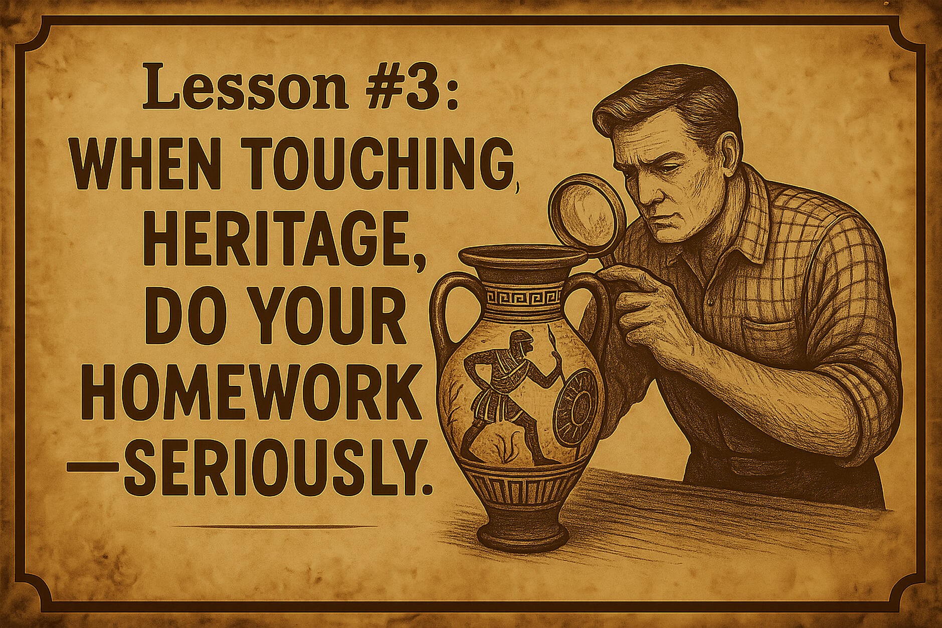
The fact that Cracker Barrel reversed this decision in ONE WEEK tells you everything about their research process.
What research? Asking a few Gen Z customers what they think about a logo mockup?
Real brand research involves understanding:
What your customers emotionally connect with (not just what they say in a survey)
What makes you distinctive in the market
What brand equity you've actually built over time
How changes will impact both existing and potential customers
I guarantee they didn't test this properly. If they had, someone would've said: "Hey, removing Uncle Herschel might be a problem."
The principle: The bigger the heritage, the more careful you need to be. This isn't a startup pivot—this is 50 years of brand equity on the line.
How Cracker Barrel Should Have Approached This
If I were leading this rebrand (which clearly, I should've been), here's what I would've done:
Keep Uncle Herschel—But Make Him Better
Don't remove the character. Modernize him.
Update the illustration to be cleaner and more versatile
Create animated versions for digital and social media
Make him more prominent in marketing, not less
Tell his story better—most customers didn't even know the real Uncle Herschel was the founder's uncle
Evolve the Crest, Don't Delete It
The old logo had complexity—the chair, the barrel, the details. That's what made it distinctive.
Instead of removing half of it, walk the extra mile to make that character even more alive. Give him personality. Make him the spokesperson. Create content around him.
Imagine if Cracker Barrel had launched a campaign about Uncle Herschel's road trips across America, featuring real customer stories from their 50+ years. That's how you modernize with soul intact.
Fix the Real Problems First
The logo wasn't the problem. The real issues were:
Stagnant menu
Inconsistent store experience
Loss of relevance with younger diners
Declining dinner traffic
You know what would've helped more than a new logo? Better food, better service, better marketing that actually tells your story instead of erasing it.
The Bigger Picture: When (and When Not) to Rebrand
Here's the truth most brands don't want to hear: you probably don't need a rebrand. You need better execution.
Signs You Need a Rebrand:
Your positioning has fundamentally changed
Your target market has completely shifted
Your brand identity actively hurts conversions
You're entering a new market or category
Signs You Need a Refresh, Not a Rebrand:
Your logo "looks old" but still works
Competitors seem more "modern"
You're bored with your brand
Sales are down (this is almost never a branding issue)
Cracker Barrel needed a refresh. Maybe some menu innovation. Better digital presence. More compelling storytelling.
They didn't need to delete their most recognizable brand asset.
For a brand doing $3+ billion in annual revenue, this rebrand was a solution in search of a problem. And the market told them that loud and clear.
Final Verdict: Did Cracker Barrel's New Logo Work?
Let me give you my ratings:
Old Logo:
⭐ Brand strategy alignment: 8/10 — perfectly matched their positioning
🎨 Design execution: 9/10 — distinctive, memorable, versatile
💼 Commercial impact: 10/10 — worked for 48 years, instantly recognizable
New Logo:
🧩 Brand strategy alignment: 5/10 — tried to solve the wrong problem
⚙️ Design execution: 6/10 — technically fine, but generic
📉 Commercial impact: 7/10 — would’ve been lower if they’d kept it
My take: The old logo wasn't perfect, but it was distinctively Cracker Barrel. The new logo could've been anyone. And in branding, "could be anyone" is death.
The good news? They listened to their customers and reversed course. That takes guts (and probably cost them millions in execution costs).
But the whole situation could've been avoided with better research, better strategy, and a designer who understood that you can't solve a storytelling problem by erasing the story.
Is Your Brand Identity Actually Working?
Most DTC brands think they just need a "refresh" when what they really need is a complete strategic overhaul. (Or vice versa—I've seen brands waste $30K on rebrands they didn't need.)
Here's the real question: Is your brand helping you make sales, or is it costing you conversions?
If you're not sure, that's a problem. And it's probably costing you more than you think.
That's exactly why I created my $497 Brand Audit.
I'll tear apart your current brand identity—logo, colors, typography, messaging, positioning—and tell you exactly:
✓ What's costing you conversions
✓ What's actually working (and why)
✓ Whether you need a rebrand or just better execution
✓ Your exact next steps
The best part? The $497 audit fee becomes a deposit if you move forward with a full branding project (starting at $2K).
So you're either getting clarity for $497, or you're getting clarity AND getting $497 off your rebrand. Either way, you win.
Get Your Brand Audit →
(Perfect for brands doing $150K+ in annual revenue who are serious about scaling)
FAQ
When did Cracker Barrel change their logo?
Cracker Barrel unveiled their new text-only logo on August 19, 2025, as part of a $700 million brand transformation. However, after intense customer backlash and a 12% stock drop, they reversed the decision on August 27, 2025—just one week later.
Why did Cracker Barrel rebrand?
According to CEO Julie Felss Masino, the company was losing relevance with younger customers and experiencing stagnant sales growth. They wanted to modernize the brand to attract "new" customers (younger, more affluent demographics) while supposedly retaining traditional ones. The CEO specifically cited "highway visibility" as a reason for the logo change, though this rationale was widely questioned by design experts and customers alike.
What does the new Cracker Barrel logo look like?
The short-lived new logo featured just the text "Cracker Barrel" in a modernized typeface on a yellow background with a simple barrel-shaped element. It removed the iconic "Uncle Herschel" character (the old-timer sitting in a chair leaning against a barrel) that had been part of the logo since 1977. The company kept the gold and brown color palette but eliminated all illustrative elements. After massive backlash, they reverted to the original logo within one week.
How much does a brand rebrand typically cost?
For established brands, a comprehensive rebrand can range from $50K to several million dollars, depending on scope. Cracker Barrel's transformation was reportedly $700 million over three years (including store remodels and operational changes, not just the logo). For DTC brands doing $150K-$10M in revenue, expect to invest $8K-$50K for a strategic rebrand that includes positioning, visual identity, and brand guidelines. However, many brands don't need a full rebrand—they need a strategic refresh, which costs significantly less. That's why I always recommend starting with a brand audit to understand what you actually need before spending tens of thousands on changes that might not move the needle.
The bottom line: Cracker Barrel's rebrand is a masterclass in what happens when you prioritize "modernization" over meaning. Your brand isn't just colors and shapes—it's the story you tell and the connection you build.
Mess with that story carelessly, and the market will let you know. Fast.

