BLOG
Shelf Talk
Dec 10, 2025
·
10
min read
How Ray-Ban Branding Simplicity Kept Them Iconic for 80+ Years
Most DTC brands think they need a rebrand every 3-5 years. New logo, new colors, new vibe — whatever feels fresh.
Ray-Ban has used basically the same logo since 1937.
They're still the #1 sunglasses brand in the world. Not because they chased trends. Because they didn't.
Here's the thing: Ray-Ban could afford to rebrand. They've got Luxottica money, massive market share, and endless creative resources. They choose not to. That's not stubbornness — that's strategy.
And it's exactly what most DTC founders miss when they're on their fourth Shopify theme in two years.
The Ray-Ban Brand System (And Why It Actually Works)
Let's break down what makes Ray-Ban's branding so effective:
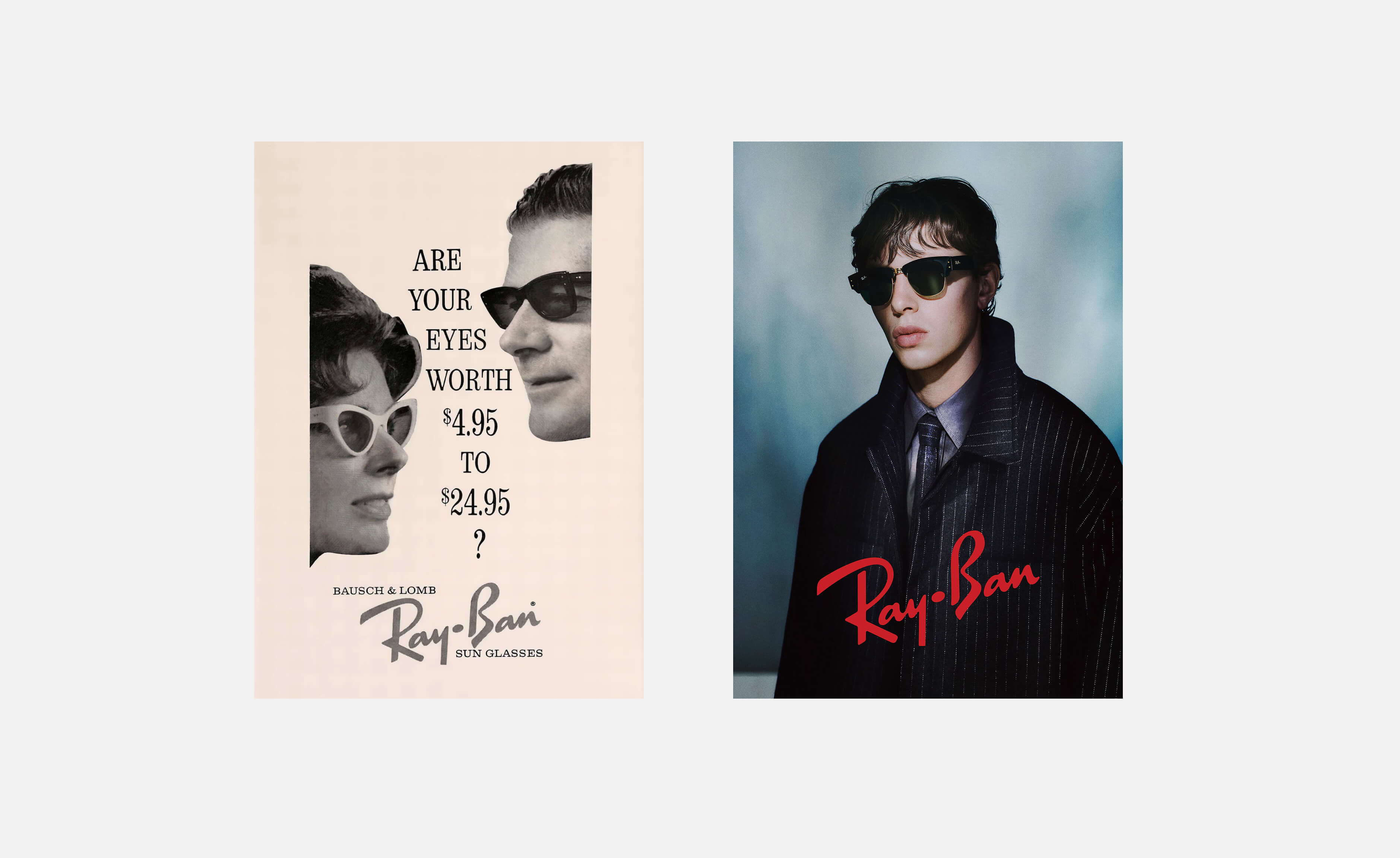
The logo: Simple serif wordmark. No swooshes, no hidden meanings, no "clever" negative space. Just clean, legible typography that works at any size.
The colorway: Black. Gold. Classic tones. They're not launching "Gen Z Neon" collections or chasing Pantone's color of the year.
The product design language: Aviators. Wayfarers. Clubmasters. These aren't just styles — they're silhouettes that have barely changed since launch. You can spot them from across a room.
The brand story: Military aviation heritage → James Dean rebel cool → timeless style icon. It's a linear narrative that compounds over decades.
Here's why this system works when most brand "systems" fall apart:
Recognition compounds over time. Every ad, every product, every touchpoint reinforces the same visual language. After 80 years, that's billions of impressions all saying the same thing.
Each product strengthens the brand. Wayfarers don't compete with Aviators — they both scream "Ray-Ban." Compare that to DTC brands where each product line looks like it came from a different company.
They own a feeling, not just a look. Cool. Confident. Classic. That feeling doesn't expire. Gradient backgrounds and rounded sans-serifs from 2019? Already dated.
Ray-Ban Logo Evolution: Strategic Consistency in Action
Let's zoom in on the logo specifically, because this is where most brands make their biggest mistakes.
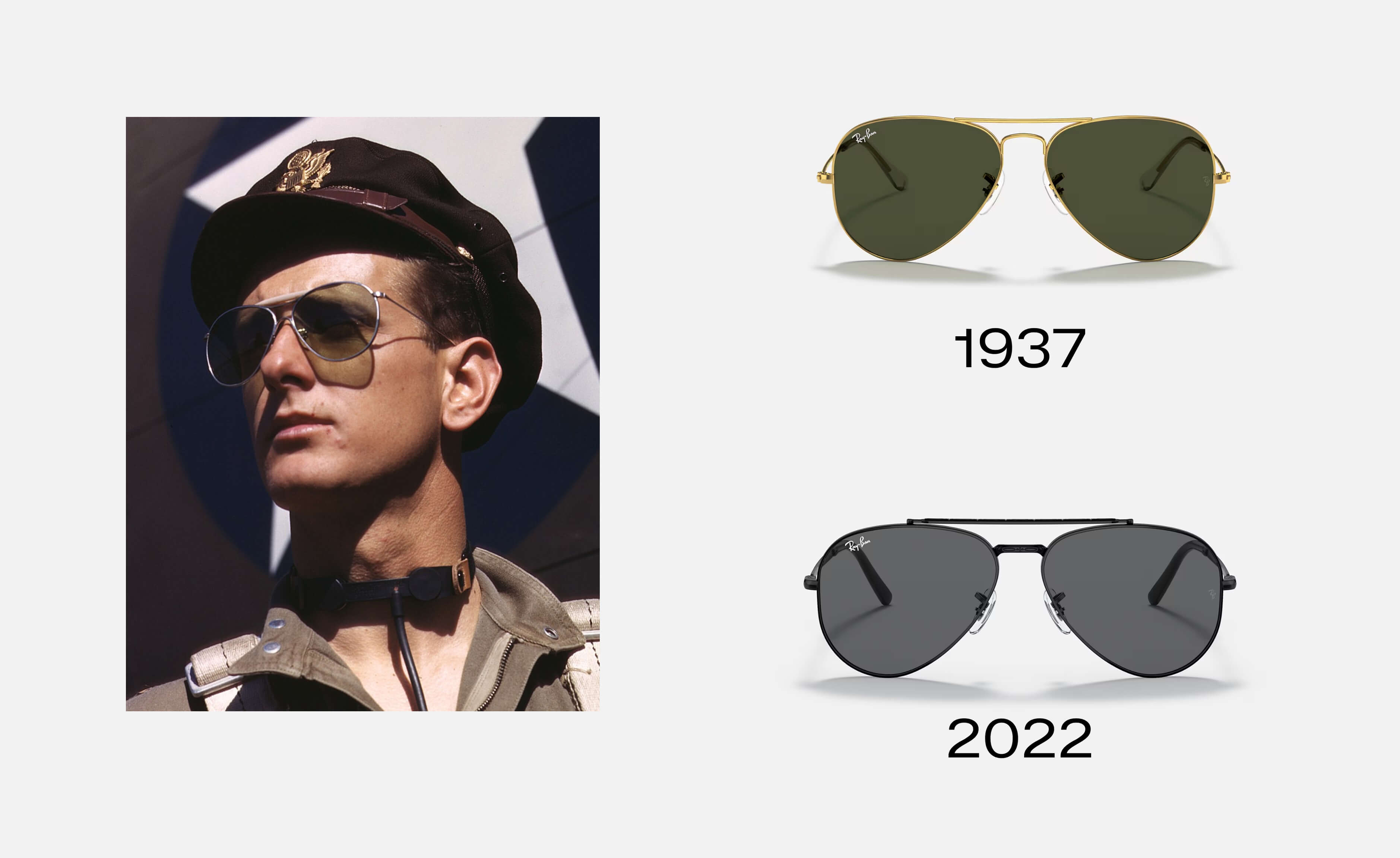
Ray-Ban's original logo from 1937 was a simple serif wordmark. Clean, readable, authoritative. Over the next 80+ years, here's what changed: almost nothing.
1937-1950s: Original serif wordmark, often paired with "Bausch & Lomb" (the original manufacturer). The typography was bold, military-inspired, fitting for a product developed for pilots.
1960s-1980s: Minor refinements to letter spacing and weight. The core design stayed identical. When the brand started appearing in Hollywood films, they didn't panic and "modernize" — they let the logo carry its heritage.
1999-Present: Luxottica acquired Ray-Ban. Most companies would rebrand. Ray-Ban didn't. They dropped the "Bausch & Lomb" attribution, cleaned up production, but kept the core wordmark virtually untouched.
P.S You can read more on the history at Ray-Ban's official website.
The strategic reasoning? Every change resets brand recognition. When you've spent decades building visual equity, throwing it away for "fresh" is financial suicide.
The typography choice matters too. That specific serif-to-sans combination (serif for "Ray," cleaner treatment for "Ban") gives it enough personality to be distinctive without being trendy. It's readable at tiny sizes (think: temple arm logos) and scales to billboards.
Compare that to the average DTC brand that redesigns every 2-3 years. They're not "evolving" — they're starting over. And customers barely noticed the old logo before it changed.
How Ray-Ban Manages 20+ Product Lines Without Brand Dilution
Here's something most people miss: Ray-Ban doesn't just make Aviators and Wayfarers. They have 20+ distinct frame styles, multiple lens technologies, kids' lines, prescription options, and even smart glasses with Meta.
So how do they keep it all feeling like one brand when most DTC companies can't keep two SKUs consistent?
Design language consistency. Every Ray-Ban frame shares core design elements:
Temple design: That signature metal hinge and logo placement is identical across styles
Material palette: Acetate, metal, glass lenses. They don't chase plastic trends or gimmick materials
Lens options: G-15 green, gradient browns, polarized variations — always rooted in their heritage colorways
Packaging: Same design system whether you buy Aviators or Clubmasters
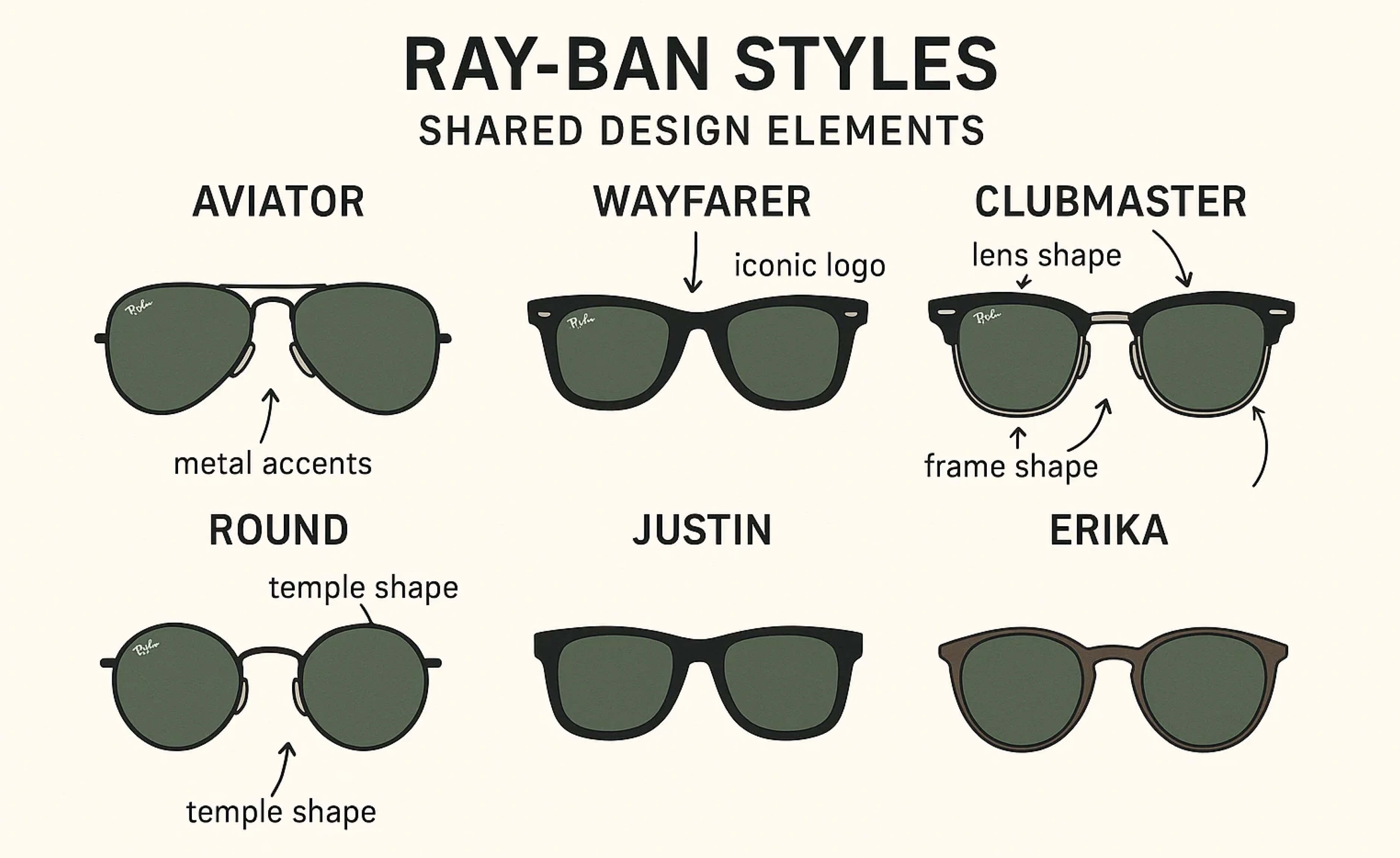
This is brand architecture done right. Each product is distinctive enough to have its own identity, but unified enough that you never question whether it's Ray-Ban.
Now look at your product line. If you showed someone your SKUs without logos, would they know it's all the same brand? If not, you're missing a massive opportunity for recognition and trust.
The DTC application: Create a design system for your products — colors, materials, packaging structure, photography style — and don't deviate. Every new SKU should strengthen your brand, not fragment it.
The Celebrity Partnerships That Built Cultural Equity
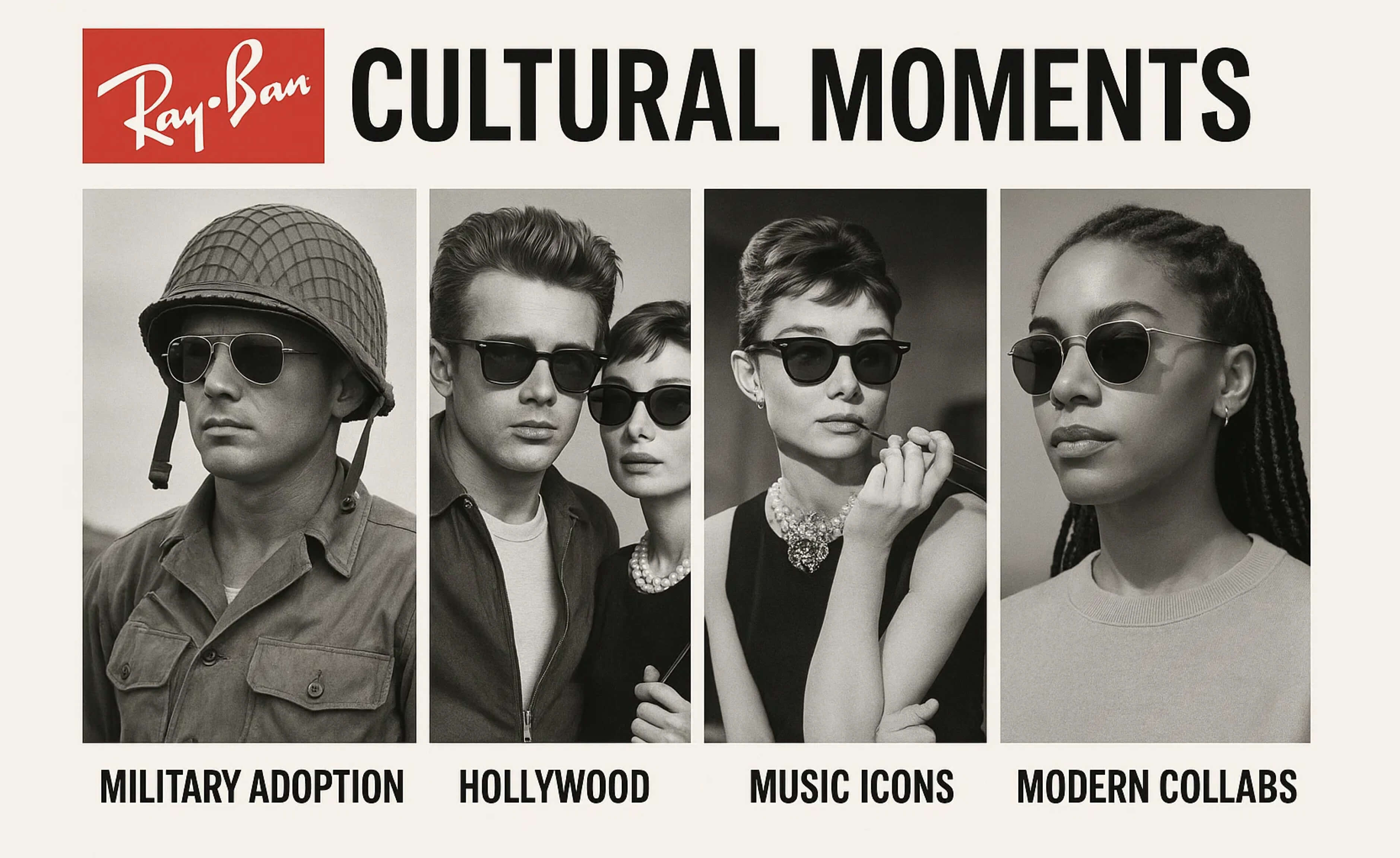
Ray-Ban's brand value isn't just from good design. It's from 80 years of being worn by the right people at the right moments.
The genius? Most of it was organic.
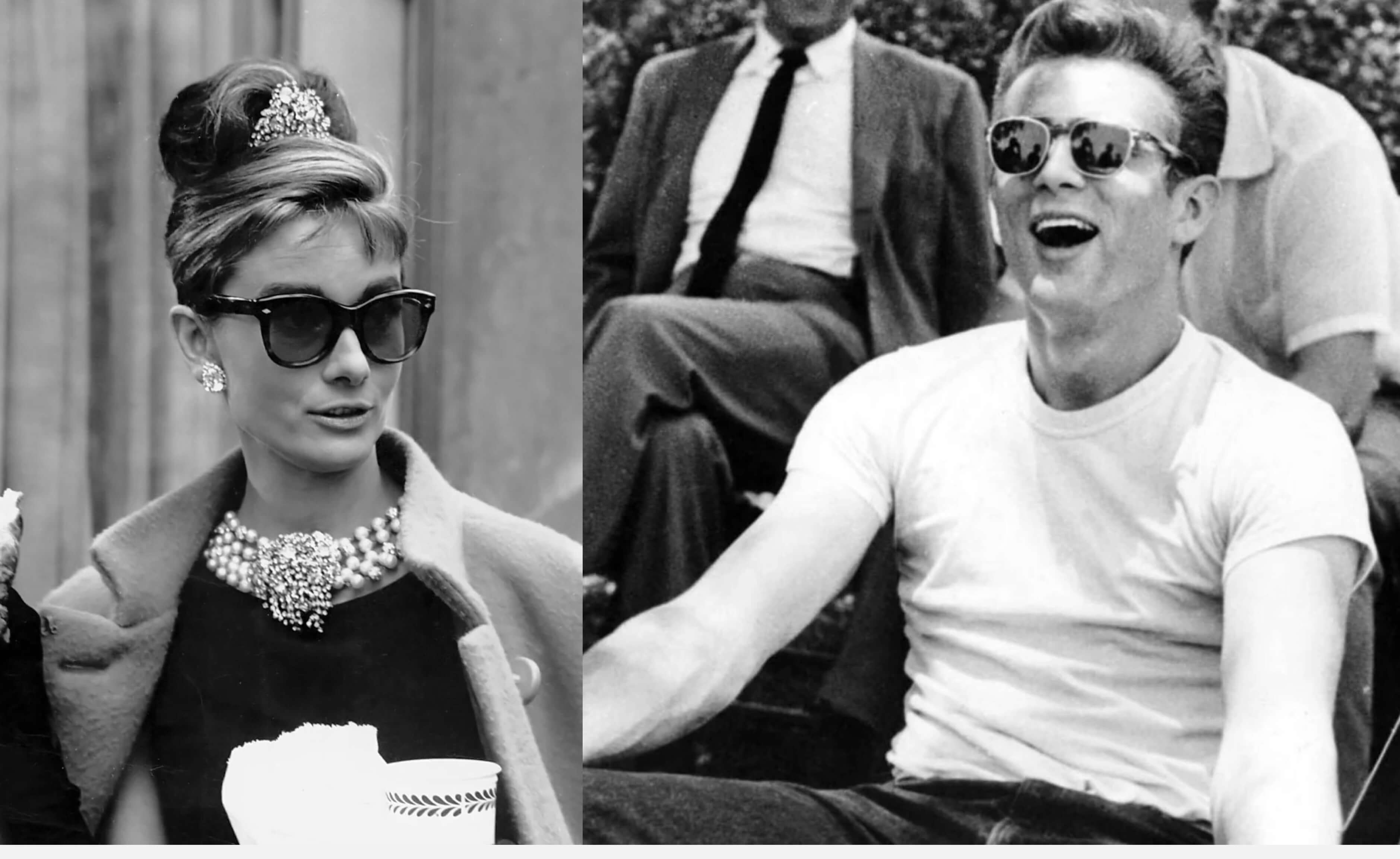
James Dean wore Wayfarers in "Rebel Without a Cause" (1955). Ray-Ban didn't pay for that placement. He just thought they looked cool. But that one moment tied Ray-Ban to rebellious, effortless style for generations.
Audrey Hepburn in "Breakfast at Tiffany's" (1961) — oversized sunglasses became synonymous with elegance and mystery. Again, organic.
Tom Cruise in "Top Gun" (1986) — Aviators sales exploded 40% after that film. Ray-Ban capitalized on it, but they didn't manufacture it. The brand equity was already there.
Here's the pattern: Ray-Ban built a brand that cool people wanted to wear. They didn't have to pay for credibility — the product and brand positioning attracted the right associations naturally.
Fast-forward to today: influencer marketing, paid partnerships, #ad disclosures. Ray-Ban still does partnerships (Meta smart glasses, fashion collabs), but they've never relied on paid credibility to carry the brand.
The DTC lesson: You can't buy authenticity. But you can build a brand that attracts authentic advocates. Focus on making something actually good, position it clearly, and let early adopters do the heavy lifting.
If your brand only exists through paid ads and influencer posts, you're renting attention. Ray-Ban owns their cultural equity.
Ray-Ban vs. The Competition: What Went Different
Let's get comparative. Why did Ray-Ban win when competitors with similar products and bigger budgets couldn't?
Ray-Ban vs. Oakley: Oakley dominated sports eyewear in the 90s and 2000s. But they went too niche. Every product screamed "extreme sports" and "performance." When mainstream consumers wanted sunglasses, Oakley felt too aggressive, too specific.
Ray-Ban stayed accessible. Aviators work for pilots and for brunch. That flexibility kept them relevant across demographics.
Ray-Ban vs. Warby Parker: Warby Parker is the DTC success story of the 2010s. They built a brand around affordability and home try-ons. But here's what they don't have: heritage. Their story is "we disrupted an industry." Ray-Ban's story is "we've been cool for 80 years."
Both are valuable. But only one compounds over time. In 20 years, Warby Parker might have heritage. Ray-Ban already does.
Ray-Ban vs. Generic Brands: Gas station sunglasses cost $10. Ray-Bans cost $150+. The product difference doesn't justify a 15x markup. The brand does.
Generic brands compete on price because they have no story, no design equity, no cultural associations. Ray-Ban competes on identity. People don't buy Ray-Bans to protect their eyes — they buy them to feel like a certain version of themselves.
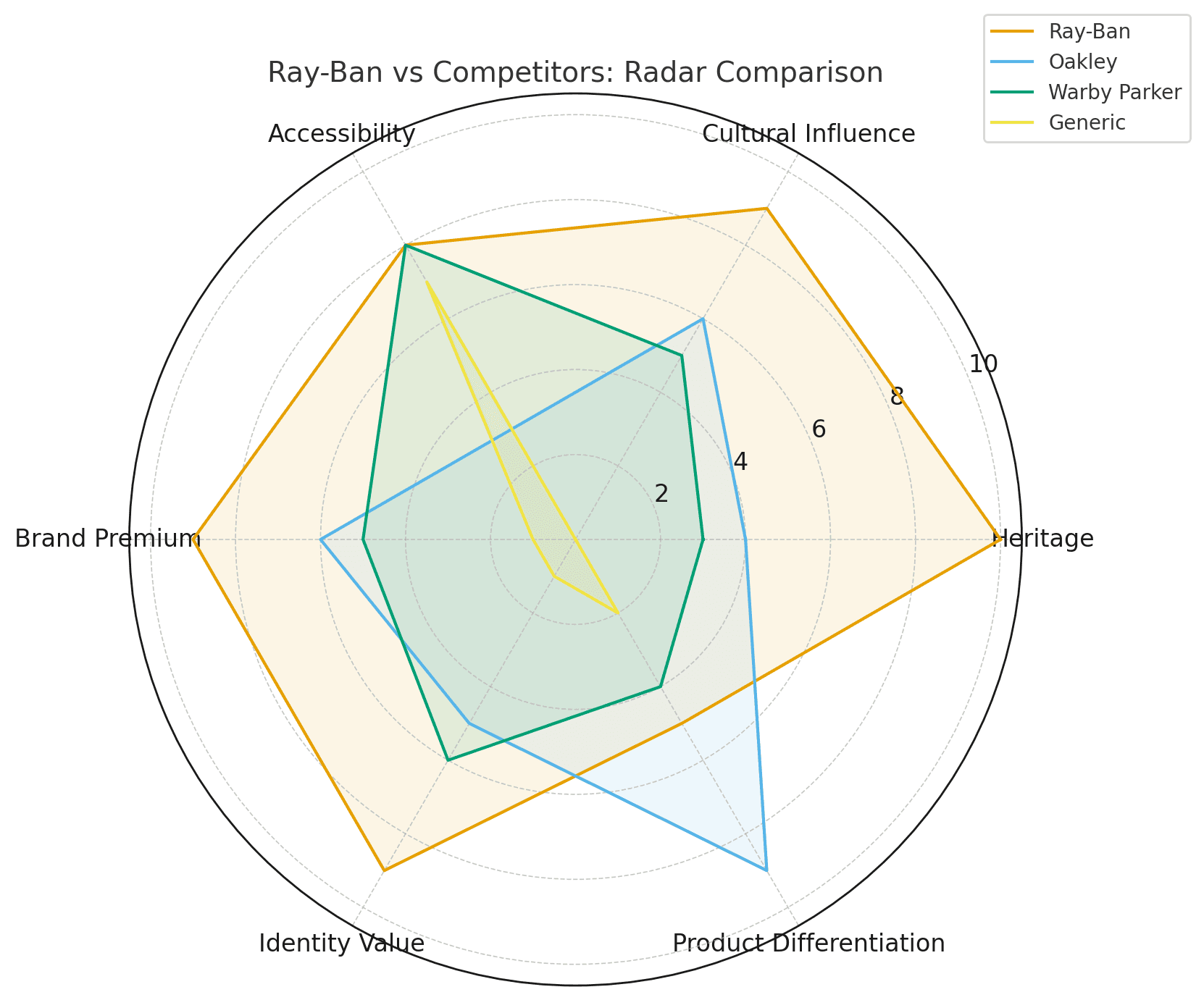
The DTC takeaway: You can't out-heritage Ray-Ban. But you can avoid Oakley's mistake (too narrow) and build what Warby Parker built (a story that compounds). The goal isn't to be Ray-Ban. It's to be the only version of you.
Ray-Ban's Color & Material Strategy (And Why It Matters)
Here's a detail most people overlook: Ray-Ban has signature colors that have barely changed in 60+ years.
Black frames. Classic. Never goes out of style.
Gold/Tortoiseshell accents. Warm, premium, timeless.
G-15 green lenses. This specific lens color was developed for military pilots and became a signature. It's functional (reduces glare without distorting colors) and iconic.
These aren't random choices. They're strategic decisions that reinforce the brand's positioning: timeless, premium, functional.
Compare that to brands that chase seasonal Pantone colors. One year it's millennial pink. Next year it's Gen Z yellow. Two years later, your brand looks dated because those colors are tied to a specific moment.
Materials follow the same logic. Ray-Ban uses acetate and metal because they're durable, they age well, and they feel premium. They don't chase cheap plastic alternatives even though margins would be better.
For DTC brands: Choose brand colors that won't expire. Ask yourself: "Will this color feel dated in 5 years?" If yes, simplify. Black, white, navy, earth tones, maybe one signature accent — that's a color palette that compounds.
What Most DTC Brands Get Wrong (And Why It Kills Growth)
Now here's the painful part. Most DTC brands are doing the exact opposite:
Chasing trends instead of building equity. Every rebrand erases recognition you spent months or years building. Your customers have to relearn who you are. That's not growth — that's starting over.
Rebranding when you're bored, not when there's a strategic reason. Founders get tired of looking at their own brand. Customers barely noticed it yet. There's a massive gap between your exposure to your brand and theirs.
Trying to be everything to everyone. Ray-Ban doesn't make athleisure sunglasses or "biohacker" blue-light blockers. They make Ray-Bans. That clarity is valuable.
No heritage = no story = nothing to protect. This is the big one. Story is what makes you unique. Ray-Ban has 80 years of military aviation, Hollywood icons, and cultural moments. What do most DTC brands have? A seed round announcement and some influencer partnerships.
You can't buy heritage, but you can build it — if you commit to consistency long enough for it to compound.
The biggest branding mistake isn't having bad design. It's destroying the history you're building before it has time to become valuable.
What You Can Steal From Ray-Ban (Even If You Started Yesterday)
Okay, tactical time. Here's what you can actually apply to your brand:
1. Pick a Visual System and Compound It
Ray-Ban didn't redesign every time a creative director got bored. They made small refinements — cleaner production, better materials, modern photography — but the core stayed the same.
For your brand: Choose a logo, a color palette, a typography system. Then stop second-guessing it. Give it 3-5 years minimum before you even think about changing it. Your brand equity is built through repetition, not novelty.
2. Make Your Products Instantly Recognizable
Wayfarers aren't just sunglasses. They're a shape. A silhouette. You see them in a movie, in an ad, on the street — you know.
For your brand: What's your "Wayfarer"? What element makes your product unmistakably yours? Could be packaging, could be a signature design detail, could be how you shoot product photos. But it needs to be consistent and distinctive.
3. Build Story Through Consistency, Not Just "Heritage Aesthetic"
Every brand tries to fake heritage with vintage filters and serif fonts. Ray-Ban has heritage because they showed up consistently for 80 years.
For your brand: Act like you're building a brand that will be around in 80 years. That means making decisions that compound, not expire. Document your journey. Show up consistently. Heritage isn't retro design — it's cumulative trust.
4. Let the Brand Age, Not the Design
Ray-Ban was cool in 1960. Still cool in 2025. That's because "timeless" is a real design principle, not just marketing speak.
Trendy dies. Timeless doesn't.
For your brand: When designing, ask "will this look dated in 3 years?" If yes, simplify. Remove the thing that will age poorly. Gradient overlays, hyper-trendy typography, whatever aesthetic is saturating your industry right now — that's the stuff that expires.
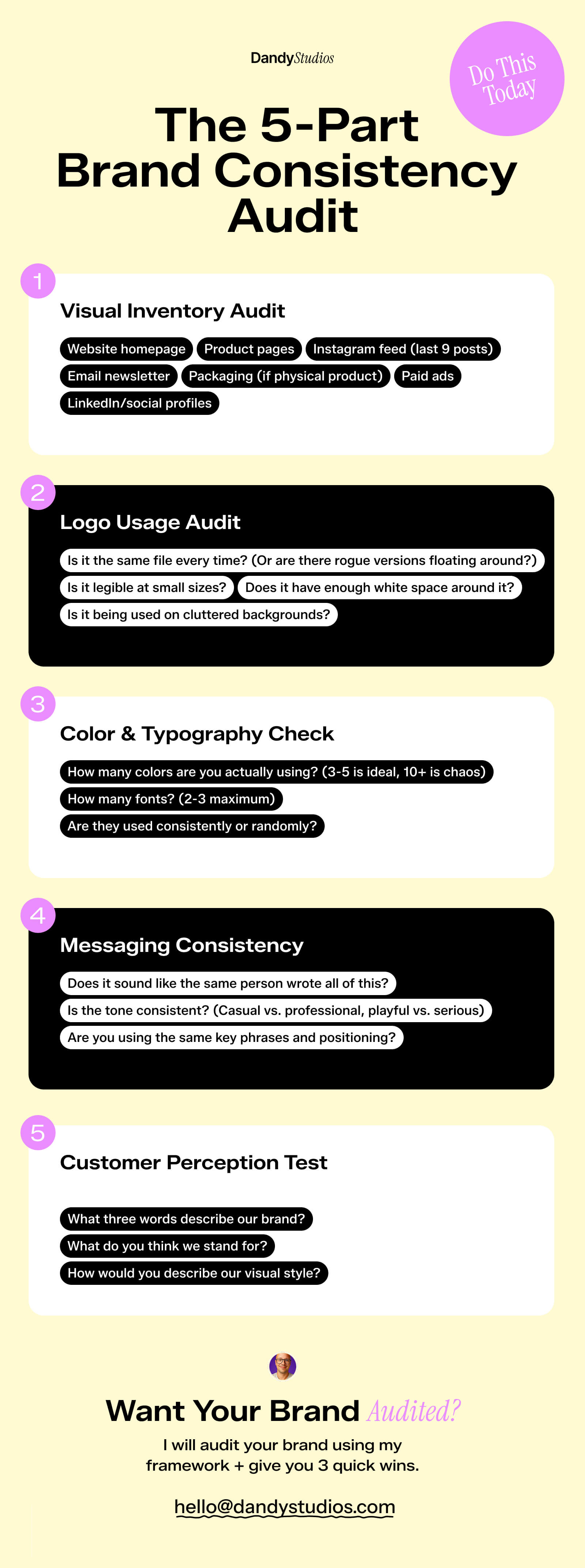
The 5-Part Brand Consistency Audit (Do This Today)
Want to know if your brand is building equity or resetting it? Run this audit on your own brand:
Part 1: Visual Inventory Audit
Screenshot every customer touchpoint:
Website homepage
Product pages
Instagram feed (last 9 posts)
Email newsletter
Packaging (if physical product)
Paid ads
LinkedIn/social profiles
Lay them out side by side. Do they all look like the same brand? Or do different channels have different vibes?
Red flags:
Logo appears in different colors or treatments
Typography changes across channels
Inconsistent product photography style
Different brand voice/messaging
Fix: Create a simple brand guide (even a 1-page doc) with logo usage, colors, fonts, and photography guidelines. Share it with everyone who touches your brand.
Part 2: Logo Usage Audit
Open every place your logo appears. Check:
Is it the same file every time? (Or are there rogue versions floating around?)
Does it have enough white space around it?
Is it legible at small sizes?
Is it being used on cluttered backgrounds?
Red flags:
Multiple logo versions with no clear system
Stretched or distorted logos
Illegible at small sizes
Too many "special" versions (holiday logos, event logos, etc.)
Fix: Pick ONE logo version. Create lockup rules (minimum size, clear space, approved backgrounds). Delete all other versions from your shared drives.
Part 3: Color & Typography Check
Document every color and font that appears across your brand:
How many colors are you actually using? (3-5 is ideal, 10+ is chaos)
How many fonts? (2-3 maximum)
Are they used consistently or randomly?
Red flags:
More than 5 brand colors in regular use
Different fonts on website vs. social vs. packaging
Colors that don't work together
"Close enough" versions of your brand colors
Fix: Define a strict color palette (primary, secondary, accent). Define 2 fonts maximum (one for headings, one for body). Use them everywhere. No exceptions.
Part 4: Messaging Consistency
Read your website copy, Instagram captions, email subject lines, and product descriptions out loud.
Ask:
Does it sound like the same person wrote all of this?
Is the tone consistent? (Casual vs. professional, playful vs. serious)
Are you using the same key phrases and positioning?
Red flags:
Website is professional, Instagram is overly casual
Inconsistent brand voice across channels
No clear positioning message
Every piece of copy feels like a different brand
Fix: Write down your brand voice in 3-5 adjectives (e.g., "confident, educational, no-BS"). Write a one-sentence positioning statement. Use them as filters for all copy.
Part 5: Customer Perception Test
This is the reality check. Ask 5 people who know your brand:
"What three words describe our brand?"
"What do you think we stand for?"
"How would you describe our visual style?"
If their answers align with what you think your brand is, you're consistent. If they're all over the place, your brand is fragmented.
Red flags:
Responses are vague or generic
No alignment between what you intend and what they perceive
They describe old branding that you've "moved on from" (meaning: they didn't notice the change)
Fix: Simplify. Clarify. Repeat. Your brand message needs to be consistent long enough for people to actually absorb it.
When You Actually SHOULD Rebrand (The Only 3 Reasons)
Let's be clear: most rebrands are a mistake. But there are legitimate reasons to start over. Here are the only three:
1. Your brand is actively hurting conversions
Not "I'm bored with it." Not "our competitor has a cooler logo." I mean: your brand positioning is confusing customers, your visual identity is so broken it's illegible, or your messaging is actively turning people away.
Example: You started as a budget brand but now you're premium. Your old branding screams "cheap." That's costing you sales. Rebrand.
2. You've pivoted to a completely different market
If you started selling protein powder to bodybuilders and now you're selling wellness products to yoga moms, your brand probably doesn't fit anymore. The positioning, tone, and visuals need to align with your new audience.
3. You've made a major acquisition or merger
When two companies become one, sometimes a rebrand makes sense to signal the new entity. But even then — look at what Luxottica did with Ray-Ban. They kept the brand. Because the brand had value.
What's NOT a reason to rebrand:
You're bored with your current brand
A competitor changed their look
You saw a cool design trend on Dribbble
It's been "a few years" and you feel like you need something fresh
Your brand isn't perfect (spoiler: it never will be)
Ray-Ban case study: When Luxottica acquired Ray-Ban in 1999, they had every corporate reason to rebrand. Instead, they cleaned up production, improved quality, and kept the brand intact. That decision preserved billions in brand equity.
The decision framework:
Is the brand confusing or actively harmful? → Consider rebrand
Is the brand just "not perfect"? → Refine, don't rebrand
Are you bored? → That's not a customer problem, that's a founder problem
The One Thing Even Ray-Ban Gets Wrong
Here's some nuance: Ray-Ban's digital experience is generic.
Their website? Standard Luxottica template. Same structure as Oakley, same as Persol. The brand storytelling that works so well in physical retail and advertising barely exists online.
Even the best heritage brands can fumble the online experience. It's a reminder that branding isn't just visual identity — it's every touchpoint. And right now, most heritage brands are leaving money on the table in ecommerce.
For you? That's an opportunity. If you're a DTC brand, your website is your storefront. You can't afford to be generic there.
Key Takeaways
Let's wrap this up:
Brand equity is built over decades, destroyed in one rebrand. Every time you change your look, you reset the clock. Ray-Ban understood this in 1937. Most founders learn it after rebrand #4.
Simplicity scales, complexity confuses. The more elements in your brand system, the more ways it can break. Ray-Ban kept it simple: great products, consistent identity, clear story.
If you're a new brand, act like you plan to be around in 80 years. Make decisions that compound. Document your story. Show up consistently. That's how heritage gets built.
Consistency is a competitive advantage most founders underestimate. In a world where every brand rebrands every few years, simply staying recognizable is differentiation.
Ready to Build a Brand That Lasts?
Most DTC brands don't have 80 years to figure this out. You need a brand system that works now and compounds over time.
If you're doing $150K+ in annual revenue and you're tired of generic branding that doesn't convert, let's talk.
Get Your Brand Audit - $497 →
Our Brand Audit breaks down exactly what's working, what's not, and what changes will move the needle. And it credits 100% toward a full branding project if we work together.
No fluff. Just strategic clarity on what your brand needs to scale.
Dandy Studios works with DTC brands doing $150K+ to build recognizable, scalable brand systems. See works →

Dec 2, 2025
·
12
min read
Orbio World Case Study: How They Built €153M Revenue with 22 Brands (And What Their Branding Strategy Reveals)
You've seen the ads. A memory foam pillow that promises to cure neck pain. Japanese kitchen knives "handmade by third-generation bladesmiths." A spinning scrubber that makes cleaning effortless. They appear on Facebook, Instagram, YouTube—short, punchy videos demonstrating products you didn't know you needed.
Behind these ads sits Orbio World, a Lithuanian company that generated €153 million in revenue in 2024 by operating 22+ separate consumer brands. They've mastered the art of performance marketing at scale, generating 7.8 billion ad impressions annually and reaching 10 million consumers across 200 countries.
But Orbio World's story isn't just about marketing success. It's also about what happens when brilliant advertising meets commodity products and disposable brand strategy—a case study that reveals both the possibilities and limitations of white-label dropshipping at scale.
The numbers behind the operation
Orbio World emerged from the 2022 merger of digital marketing agency YNOT Media and e-commerce company Ekomlita, both founded by Andrius Valatka and Marius Buzaitis in Kaunas, Lithuania. The business model is straightforward: source generic products from Chinese factories, create compelling brand narratives, drive traffic through performance advertising, and sell direct to consumers.
Their portfolio includes brands you've likely encountered:
Derila - Memory foam pillows ($25-40)
Huusk & Matsato - Kitchen knives marketed as "Japanese" ($40-60)
Synoshi - Electric cleaning scrubbers ($35-50)
Nuubu - Detox foot patches ($30-45)
Tvidler, Klaudena, Poliglu, Enence, Haarko, Fuugu, Melzu, Ryoko - Plus approximately 14 more
The financial reality is striking: €153.2 million in 2024 turnover with only €1.96 million gross profit—a 1.3% margin. This isn't a product business. It's a marketing arbitrage operation that happens to move physical goods.
The company employs 242-368 people (reported range varies by source) and operates through multiple subsidiaries including US entity EcomLT LLC in Tennessee. They've bootstrapped this growth without venture capital, proving the model's commercial viability through sheer execution.
The marketing machine that drives everything
Orbio World's core competency is industrial-scale direct response advertising. Their 2024 metrics tell the story:
7.8 billion ad impressions annually
136 million clicks across all campaigns
€50-100 million estimated annual ad spend (inferred from 1.3% margins)
Their acquisition channels span the entire digital advertising ecosystem:
Meta/Facebook Ads (primary driver)
TikTok Ads (growing channel with dedicated creative team)
YouTube Ads (long-form product demonstrations)
Native Advertising (Apple News, MSN, news sites)
TV Advertising (UK channels including Sky Cinema)
Affiliate Marketing (CPA programs paying $25-60 per sale)
The team structure reveals priorities: Senior Google Media Buyer, Senior Meta/TikTok Media Buyer, Creative Strategist, Conversion Copywriter, CRO Manager, and notably a "Reputation Specialist (Reddit & Community)" for damage control.
Their advertising follows classic direct-response formulas: urgency tactics, inflated anchor pricing (showing $83 "regular price" for $25 products), volume bundle discounts, and perpetual "last day" promotions that run continuously. It works—the conversion rates necessary to sustain €153M revenue prove the creative effectiveness.
Where the model breaks: product origin versus brand claims
The commercial success becomes complicated when examining the gap between marketing narratives and product reality. Independent investigations reveal systematic patterns across multiple brands:
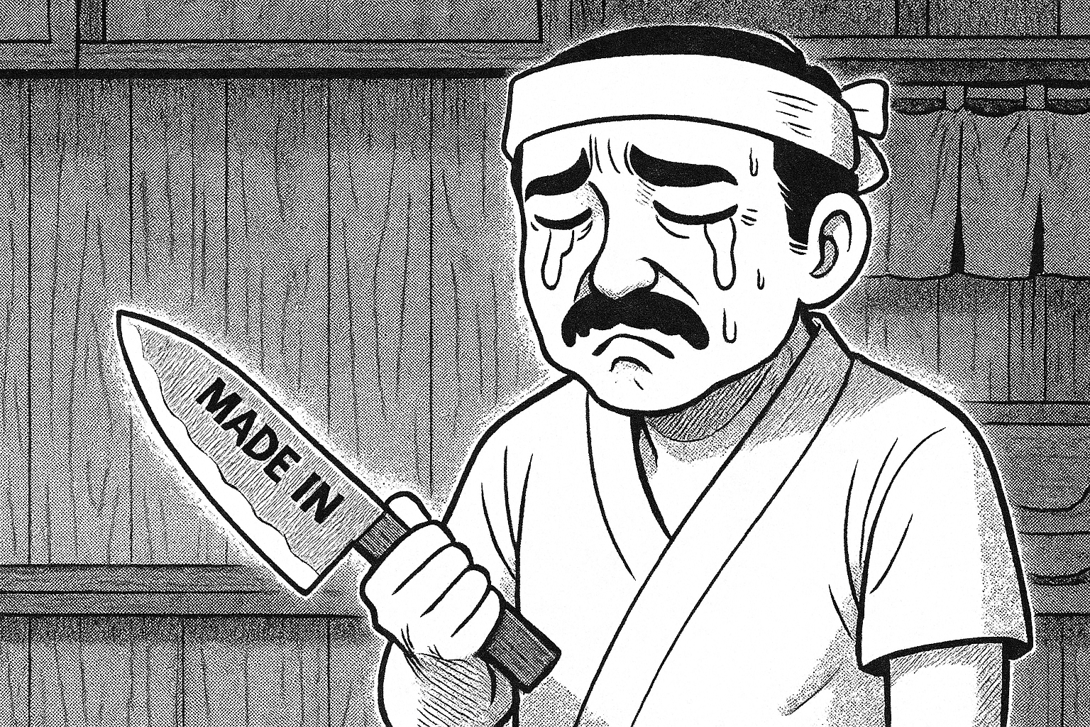
The "Japanese knife" that isn't
Both Huusk and Matsato market heavily using imagery of traditional Japanese blacksmithing. Huusk's marketing claims products are "handmade in Japan using traditional Japanese blacksmithing techniques" and "made by third-generation expert Japanese bladesmiths" requiring "138 steps and over 2 months to craft each knife."
Investigation by knife enthusiasts and consumer watchdogs reveals a different origin:
Identical knives available on AliExpress for €7-13 versus Huusk's "discounted" price of ~€35
Packaging indicates 18/10 stainless steel (standard cookware steel with 0.1% carbon content versus the 0.5%+ required for quality knife steel)
Customer photos show products marked "Made in China"
The "forged black" appearance is painted on and can be scratched off
No documented connection to Japanese manufacturing
The company is registered in Lithuania with supply chain sourced from China. The "Japanese" positioning is brand storytelling disconnected from product reality.
Memory foam that isn't memory foam
Derila pillows face similar scrutiny. Customer complaints consistently describe pillows arriving "very thin," "flat," and failing to expand properly. Independent testing by Sleep-hero.co.uk found foam that "feels firm, with barely any contouring effect" and "bounces back quickly after pressure is applied"—characteristics of low-quality polyurethane foam rather than memory foam.
The Derila pillow itself is a generic cervical memory foam pillow likely sourced for $5-8 wholesale from Chinese factories, then branded and sold for $25-40. It's functional as a basic pillow but represents significant markup over identical products available directly from original suppliers.
Analyzing Orbio World's brand portfolio: A design breakdown
To understand what works and what doesn't in Orbio World's multi-brand strategy, I evaluated five of their major brands using a branding framework focused on seven critical elements: Brand Name & Memorability, Visual Identity & Consistency, Positioning Clarity, Brand Story/Narrative, Differentiation, Trust Signals, and Brand Cohesion Across Touchpoints.
Each element is scored 1-10, with 10 being excellent execution and 1 being poor execution.
1. Derila (Memory Foam Pillows)
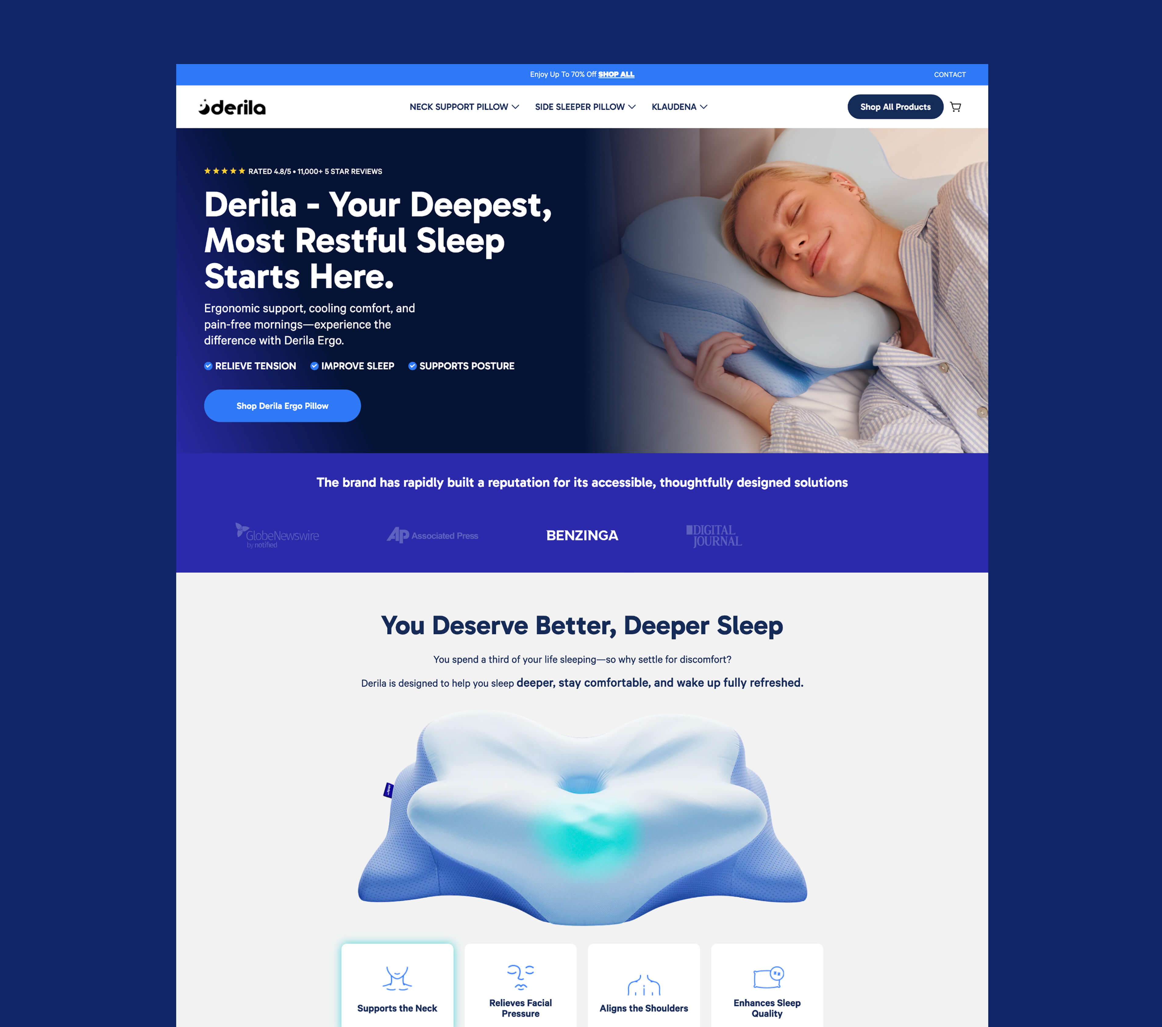
Brand Name & Memorability: 4/10 The name "Derila" is phonetically pleasant and easy to remember, but has no inherent meaning related to sleep or comfort. It's generic enough to work but creates no immediate category association. Moreover it sounds somehow Eastern European, like a flower name or what? That ending with "a" is really strange…
Visual Identity & Consistency: 5/10 Totally basic stuff. For conversions built landingpage.
Positioning Clarity: 4/10 Positioned as "ergonomic memory foam pillow for neck pain," but this positioning is identical to dozens of competitors. No clear differentiation in messaging.
Brand Story/Narrative: 3/10 There's no brand story—just product claims. This absence is strategic: building an authentic brand story requires truth, and truth would reveal the generic sourcing behind the premium positioning. It's easier to have no story than to fabricate one that collapses under scrutiny.
Differentiation: 3/10 Looking at the market, Derila's product and messaging are nearly identical to competitors. The only differentiation is aggressive advertising spend, not brand positioning.
Trust Signals: 4/10 Heavy reliance on Trustpilot reviews (24,500+), but undermined by CHOICE investigation findings and certification verification failures. The sheer volume creates social proof, but quality of signals is questionable.
Logo design: 5/10 Grandma can do this with AI. But that's old logo so no judgement here too much. Flat shape moon and stars from some freepik.com or so is not rocket science. I think it's not worth more to talk about. Period. Visually it's better then that strange name "derila".
Overall Score: 28/70 (42%)
2. Huusk (Kitchen Knives)
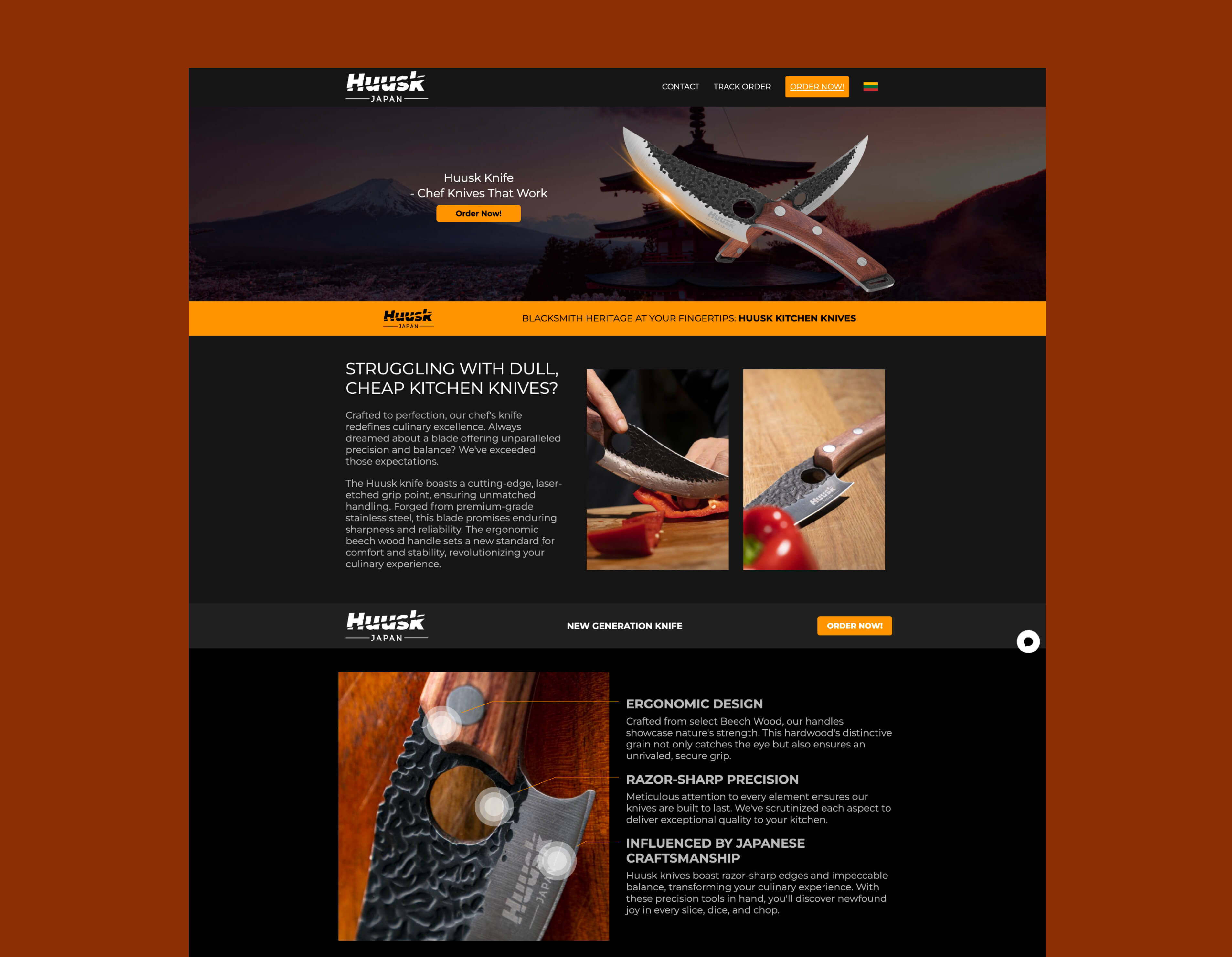
Brand Name & Memorability: 7/10 "Huusk" sounds vaguely Japanese/Nordic, which fits the intended positioning. Short, memorable, distinctive. Strong name choice despite the misleading origin story.
Visual Identity & Consistency: 9/10 Surprisingly solid execution, even if dated. The dark background website, moody product photography, and masculine color palette (blacks, metallics, muted tones) all work cohesively. It feels intentionally rugged and tool-focused rather than generic. Yes, the overall aesthetic is basic and feels 3-4 years behind current design trends, but for a knife—even a kitchen knife—this masculine, almost tactical approach makes sense. They've committed to a visual direction and maintained it across touchpoints. The consistency is there, even if the execution isn't cutting-edge.
Positioning Clarity: 2/10 Positioned as "handmade Japanese knives by third-generation bladesmiths" but this is demonstrably false. Once positioning collapses under scrutiny, there's no backup positioning to fall back on.
Brand Story/Narrative: 1/10 No authentic story exists once the Japanese manufacturing claim is debunked.
Differentiation: 3/10 Differentiated in marketing (Japanese craftsmanship) but not in product reality (generic Chinese knives available on AliExpress). Differentiation evaporates upon product receipt.
Trust Signals: 2/10 Two ASA rulings upheld against advertising. Trustpilot added disclaimer about suspected paid reviews. BBB complaints. Fake Website Buster investigations. Every trust signal undermines rather than builds credibility.
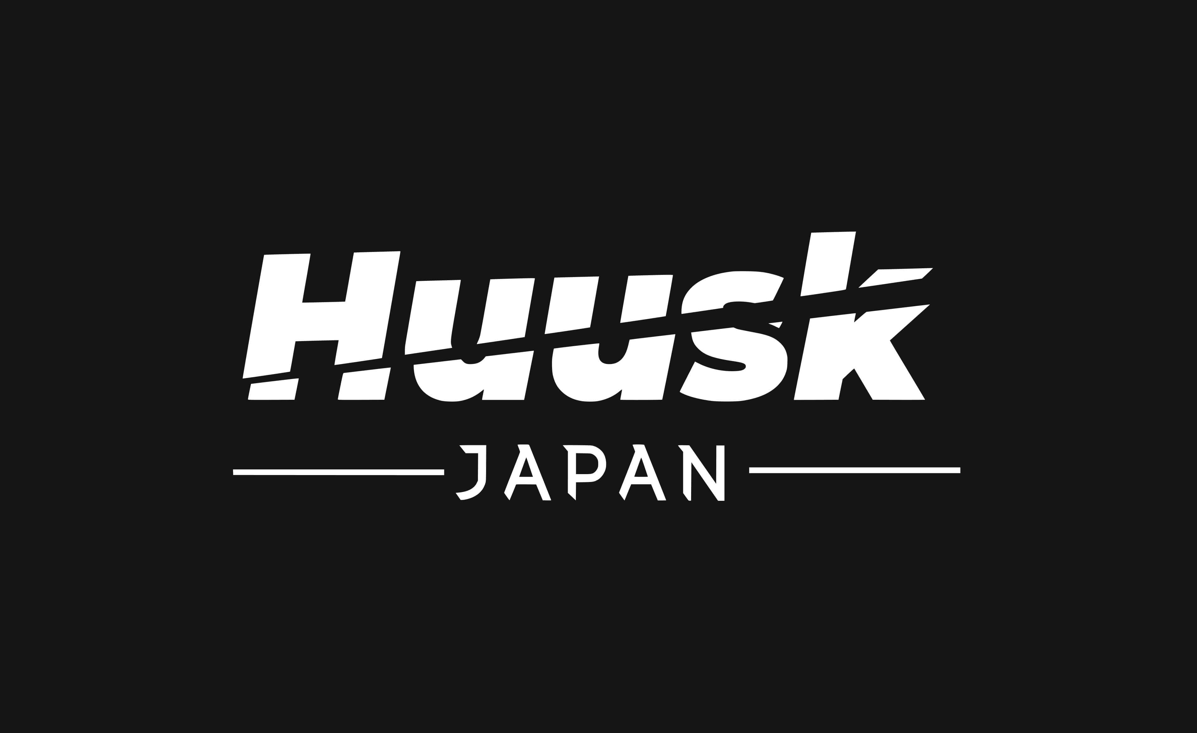
Logo Design: 10/10 Genuinely impressive. The logo is excellent—sharp angular letter cuts that feel "knife-like," the Japanese wordmark underneath uses the perfect typeface, even the typically-dated side lines work perfectly in this context. This feels like proper brand design, not just a dropshipping template. They invested in quality visual identity, and it creates a cohesive, masculine, precision-focused aesthetic. Strong work.
Overall Score: 34/70 (50%)
3. Matsato (Kitchen Knives)
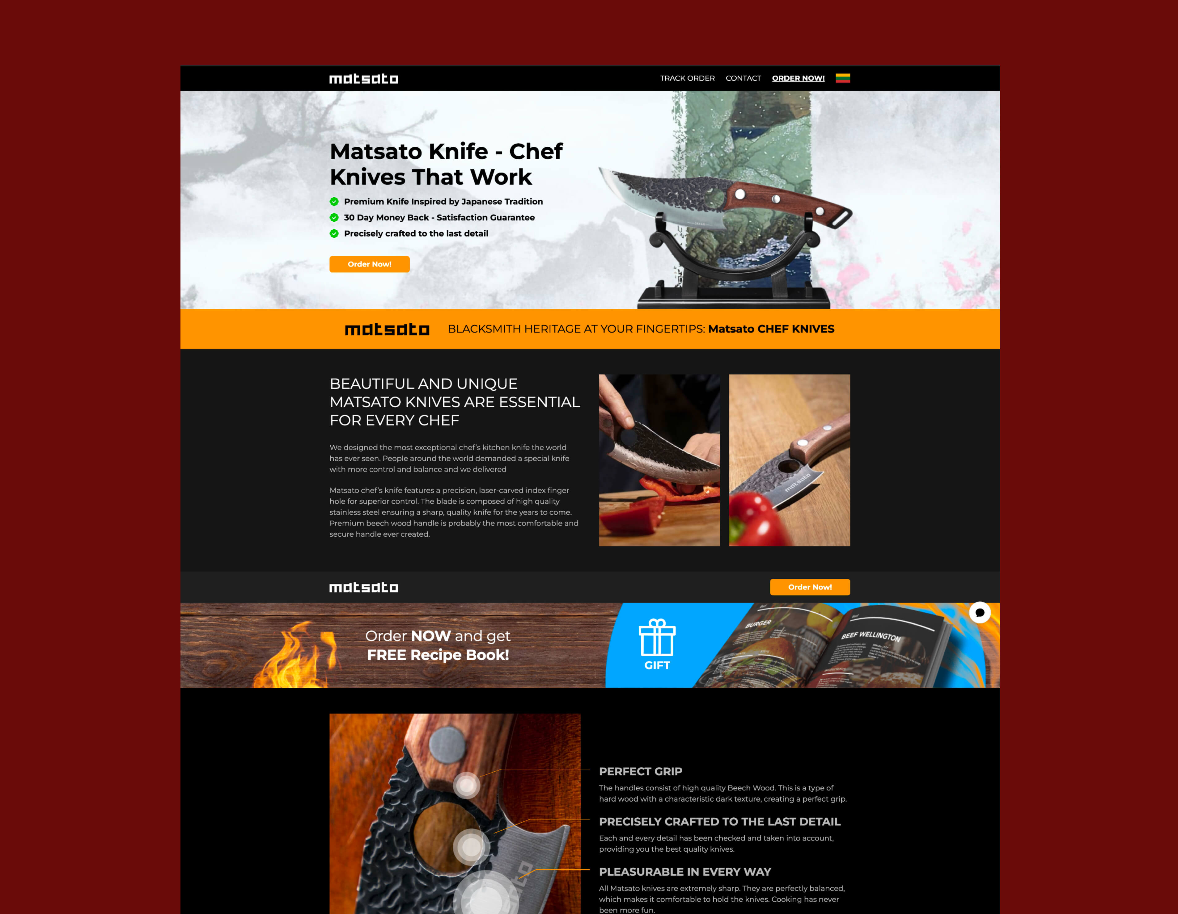
Brand Name & Memorability: 6/10 Another Japanese-sounding name following the Huusk playbook. Less distinctive than Huusk (sounds more generic), but serves the same positioning purpose.
Visual Identity & Consistency:5/10 This is essentially Huusk 2.0—same knife, different brand name. The visual identity is nearly identical: dark backgrounds, masculine aesthetic, moody product photography. The only real difference is the hero block background image. This looks like a strategic hedge: Huusk accumulated too much negative feedback and regulatory scrutiny, but the business model works, so why not launch a second brand to keep capitalizing on the same market? It's brand arbitrage, not differentiation. There's zero reason for this brand to exist separately beyond ad account diversification and reputation management.
Positioning Clarity: 2/10 Same false "Japanese craftsmanship" positioning as Huusk. Faces same credibility collapse when investigated.
Brand Story/Narrative: 2/10 No unique brand story. Same stuff.
Differentiation: 2/10 Not differentiated from Huusk (same parent company, same positioning, same product origin). Unclear why both brands need to exist unless it's pure traffic arbitrage across different ad accounts.
Trust Signals: 3/10 Fewer reviews and lower visibility than Huusk, but facing similar credibility issues. ProductReview.com.au shows pattern of complaints about quality versus claims.
Logo Design: 7/10 Standard Japanese-style font with zero distinctive features. After Huusk's genuinely excellent logo design, this feels like a rushed afterthought—slap a Japanese-looking typeface on it and ship. It's not bad enough to hurt conversion, but it's not good enough to build equity. Pure functional placeholder to get the brand live quickly.
Overall Score: 27/70 (35%)
4. Synoshi (Electric Cleaning Scrubber)
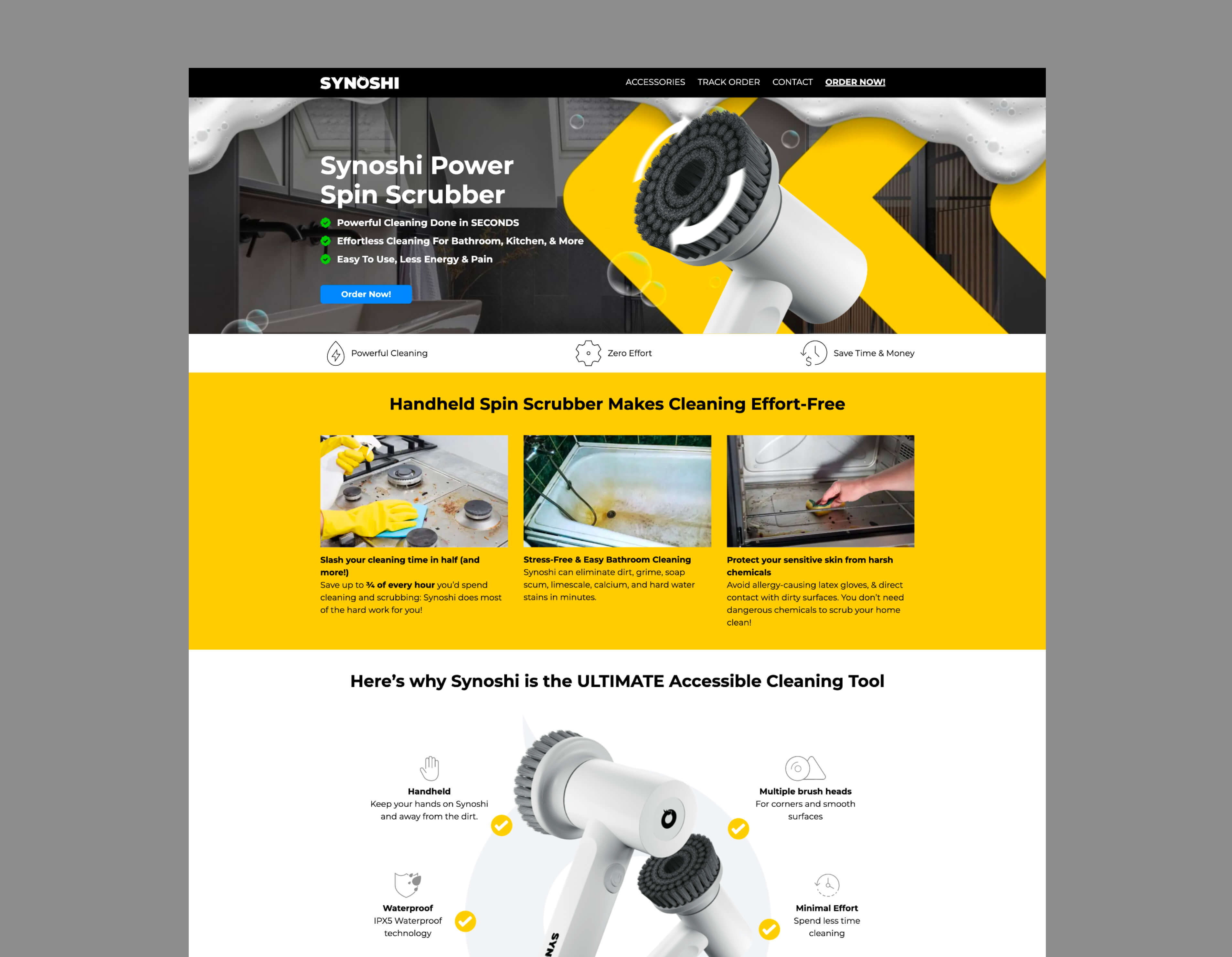
Brand Name & Memorability: 5/10 "Synoshi" feels manufactured (which it is) but has no meaning or category association. Not particularly memorable, but not offensive either.
Visual Identity & Consistency: 6/10 The yellow/black color combination works well and differentiates it from their knife brands. However, it's the same website template as Huusk and Matsato—just recolored. This template reuse is clearly a pattern across their entire portfolio: find what converts, replicate the structure, swap the colors. The visual identity is competent enough to make the product feel more innovative than it actually is (it's a generic electric scrubber), but there's no real design thinking here. It's conversion-optimized templating, not brand building.
Positioning Clarity: 6/10 [PLACEHOLDER: Screenshot of main product claim/headline] Positioned as "power scrubber that makes cleaning effortless" - at least this is verifiable and testable. Product does what it claims at a basic level.
Brand Story/Narrative: 4/10 Less reliant on fabricated heritage than knife brands. Story is more "innovative cleaning solution" which is generic but not provably false.
Differentiation: 4/10 Product category (electric scrubbers) is less commoditized than knives/pillows, giving slightly more differentiation. Still faces competition from identical products at lower prices.
Trust Signals: 3/10 Mixed reviews - some positive functionality, many complaints about durability and replacement costs. ScamAdviser rates site 39.4/100. Less regulatory action than other brands but plenty of consumer complaints.
Logo Design: 8/10 Technically well-executed. "Synoshi" has a mystical, Eastern feel, and the dragon head icon integrated into the "O" suggests heritage and craftsmanship. The problem? It's a $5 Temu product. The logo is doing heavy lifting to create perceived value that the product itself doesn't deliver. Good branding can elevate commodity products to a point, but there's a fundamental disconnect here—premium brand identity wrapping a basic electric scrubber. It works for conversion (hence the 7), but it highlights exactly what's wrong with this approach: all the investment goes into the façade, none into the actual product.
Overall Score: 36/70 (50%)
5. Nuubu (Detox Foot Patches)
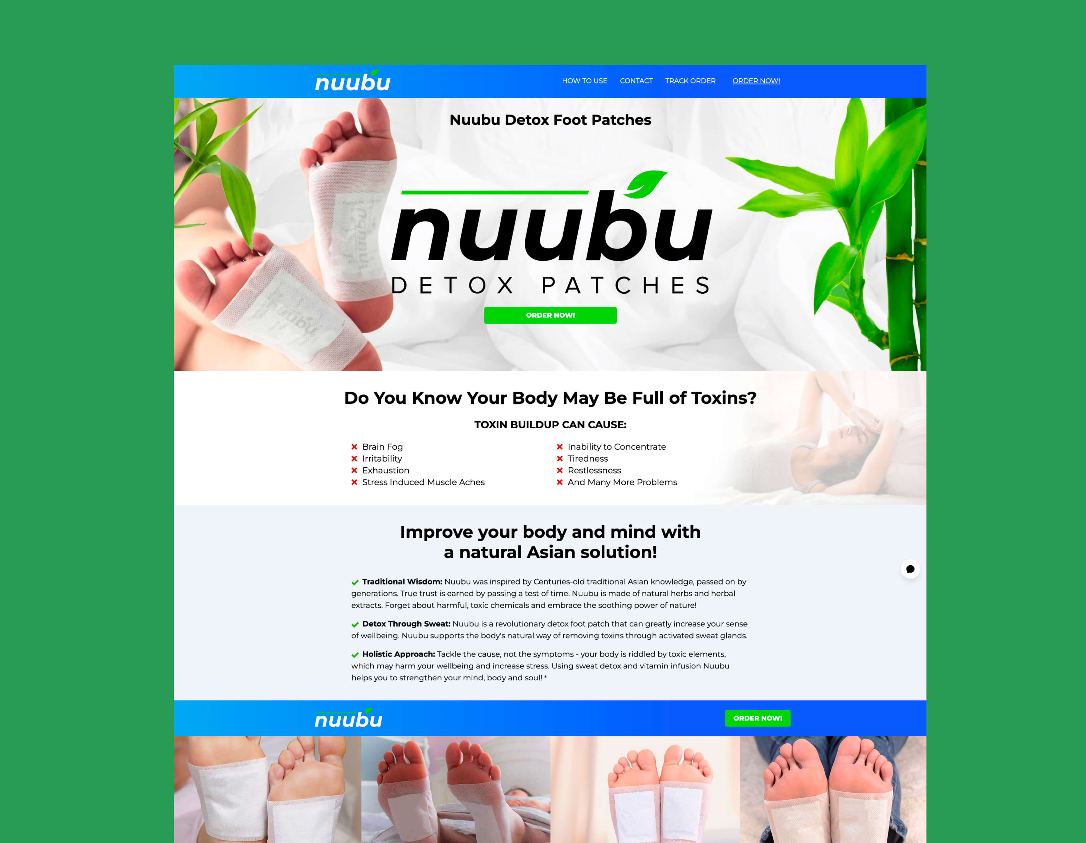
Brand Name & Memorability: 7/10 "Nuubu" has an Asian wellness feel, which fits the product category. Easy to pronounce, short, memorable enough. Generic but functional.
Visual Identity & Consistency: 4/10 Extremely basic, generic template that feels seriously outdated. The color palette is decent, but in 2025 this looks like a free template you'd find bundled with shared hosting from 2008. Transparent background product images, stock bamboo photography that screams "royalty-free clip art," zero modern design language. It's consistent in its datedness, but that's not a compliment. This visual identity actively undermines the product's credibility—it signals "cheap dropshipping operation" rather than "innovative cleaning solution." They needed to refresh this years ago.
Positioning Clarity: 3/10 Positioned around "Japanese detox tradition" and toxin removal through feet. The entire product category is scientifically questionable, which undermines positioning from the start.
Brand Story/Narrative: 2/10 Claims to be based on "ancient Japanese wisdom" but this is marketing fiction. Detox foot patches have no scientific basis, making any brand story inherently suspect.
Differentiation: 3/10 Differentiated only by brand name in a category full of identical products making identical unverifiable claims. No meaningful differentiation.
Trust Signals: 2/10 Product category itself lacks scientific credibility. Reviews are mixed with many complaints about products not working as advertised and staining issues without actual detox effect.

Logo Design: 8/10 This looks like an older brand from their portfolio—probably one of the first. For 5 years ago, this would've been solid work. Today it feels dated, but not offensively so. The interesting thing: plenty of modern brands designed by "pros" or AI tools actually look worse than this. There's a consistency and restraint here that many newer dropshipping brands lack. It's not current, but it's competent. The fundamentals are there—clear hierarchy, consistent color usage, readable typography. It scores a 7 because execution matters more than being trendy, and this executes its dated aesthetic consistently.
Overall Score: 29/70 (40%)
What the branding analysis reveals
Across all five analyzed brands, the pattern is remarkably consistent: strong brand naming and decent visual execution undermined by weak positioning, fabricated narratives, and eroded trust signals.
The average score across brands is approximately 38-42%, which reflects brands optimized for short-term paid traffic conversion rather than long-term equity building. Every brand shows the same structural weaknesses:
Names are adequate (5-7/10 range) - phonetically pleasant, easy to remember, but lack inherent meaning
Visual identity is functional (5-7/10 estimated) - professional enough for ads, but not distinctive
Positioning collapses under scrutiny (2-4/10) - either provably false (Japanese knives) or generic (pillow for neck pain)
Brand stories are fabricated or nonexistent (1-4/10) - no authentic narrative survives investigation
Differentiation is minimal (2-4/10) - separated only by marketing spend, not product or positioning
Trust signals actively undermine brands (2-4/10) - regulatory actions, fake review disclaimers, consumer complaints
Cohesion is maintained (5-7/10 estimated) - they execute consistently within each brand, even if foundation is weak
This is textbook optimization for the wrong metric. These brands convert paid traffic effectively (proven by €153M revenue) but build zero equity. The moment advertising stops, brand value is zero.
The checkout experience generates consistent complaints
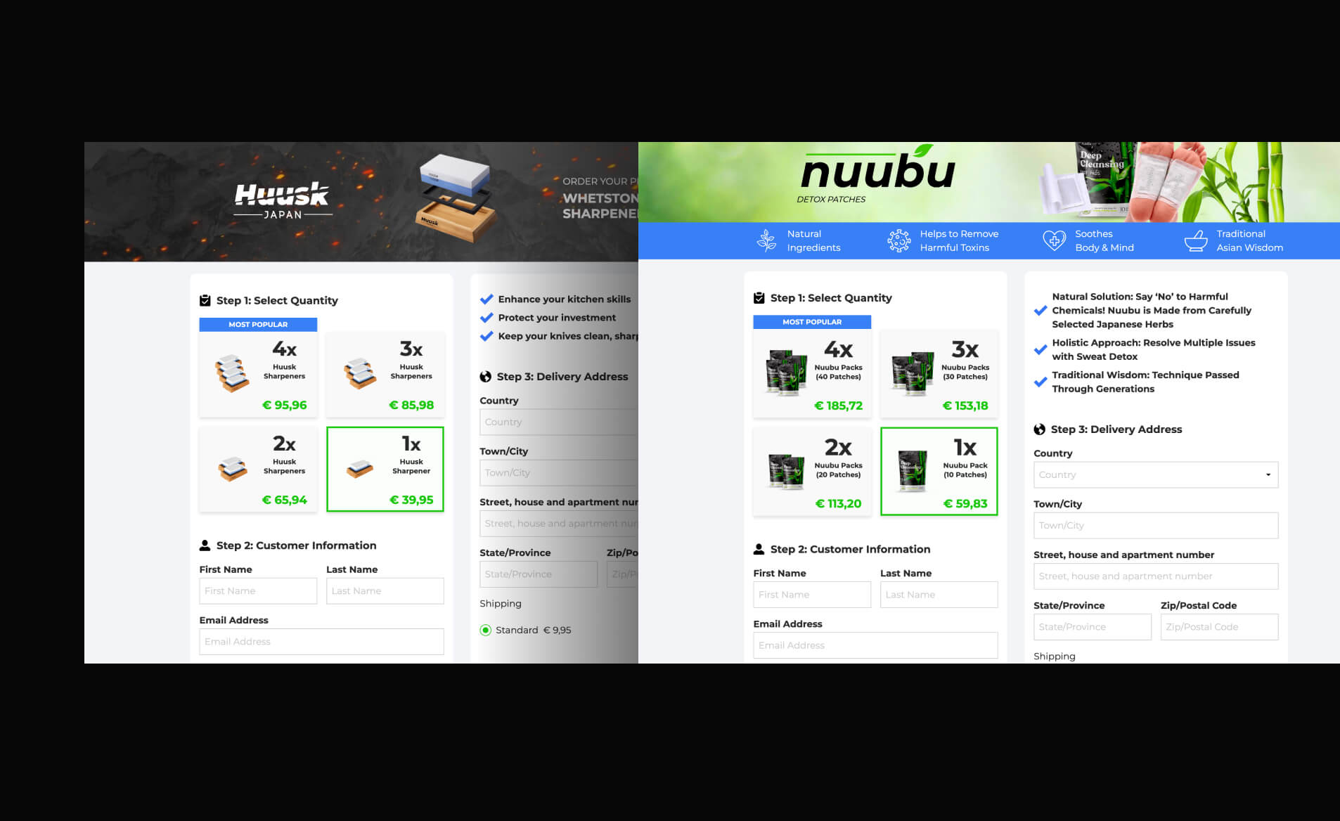
Across all Orbio brands, the single most documented complaint is checkout systems that automatically increase order quantities. The pattern appears systematic:
Derila: CHOICE confirmed ordering 1 pillow resulted in 4 pre-selected at checkout
Synoshi: Customers report ordering 1 scrubber and receiving charges for 4 units
Huusk: Reviews describe orders "sneakily defaulting" from 1 to 4 items
The checkout flow prevents backwards navigation to review orders. PayPal orders process immediately through autopay without customer verification of final quantities. This isn't a bug—it's a conversion optimization technique that increases average order value at the cost of customer trust.
Additional friction points include:
Returns requiring international shipping to Lithuania regardless of where products shipped from (often costing $75-100 for Australian customers)
15% restocking fees after 14 days
RMA approval required before return shipping
Escalating discount offers (15%, then 30%) to prevent returns
The return policy isn't designed to satisfy dissatisfied customers—it's designed to make refunds economically irrational.
A side note: While writing this article, I tested several of their brand checkouts myself. In all cases, the default selection was a single product—nothing was sneakily added to increase the quantity to 2, 3, or 4 items. It's worth acknowledging that consumers sometimes blame sellers for their own user errors or moments of inattention.
What proper brand strategy looks like in white-label
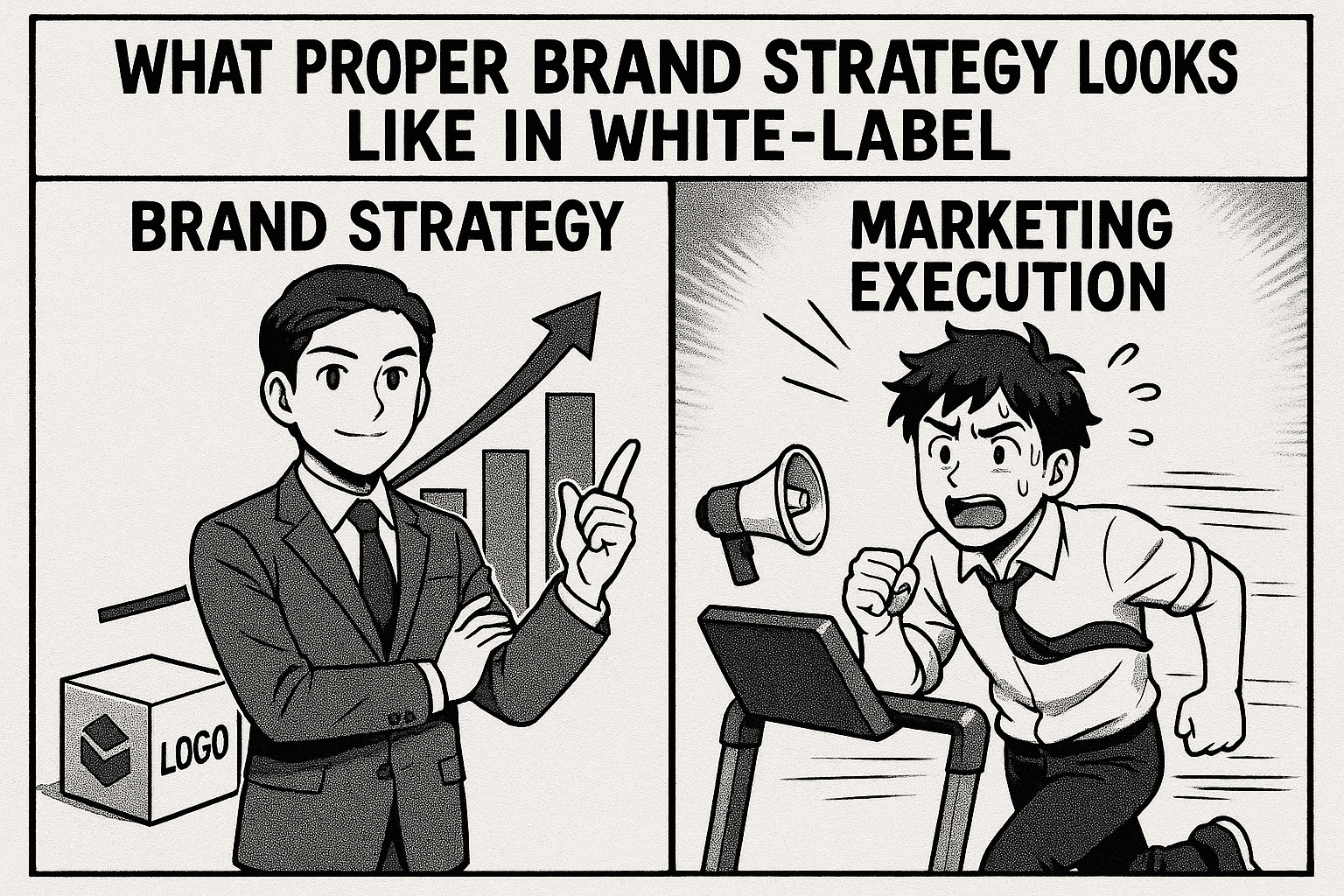
Here's where Orbio World's story becomes instructive for anyone building in this space—and where understanding the difference between marketing execution and brand strategy becomes critical.
Orbio World didn't fail at marketing. They're exceptionally good at it. They failed at building brands with equity. There's a profound difference, and it determines whether you're building an asset or just running a treadmill.
The disposable brand trap
Look at Orbio's portfolio strategy: 22+ separate brands, each operating as an independent marketing funnel. Derila for pillows. Huusk for knives. Synoshi for scrubbers. Each brand exists solely to convert ad traffic into purchases for a single product or tight product line.
This approach has one massive advantage: laser-focused messaging. Every ad, every landing page, every piece of copy speaks directly to one problem with one solution. The conversion optimization is clean. You can test relentlessly without diluting brand messaging.
But here's what they sacrificed:
Zero cumulative brand equity. Every brand starts from scratch. Every brand requires independent advertising to generate awareness. Every brand needs its own social proof, review accumulation, and trust-building. When you launch brand #23, you have zero advantage from brands #1-22. The work never compounds.
Complete advertising dependency. Stop running ads to Derila, and Derila revenue stops. There's no organic search traffic because "Derila" means nothing to anyone who hasn't seen an ad. There's no word-of-mouth because customers don't identify with the brand. There's no repeat purchase behavior because the brand doesn't represent anything beyond "that pillow I bought from an ad."
Unsellable assets. What's the exit value of a brand that generates zero revenue without continuous ad spend? These aren't businesses—they're arbitrage mechanisms. The moment advertising costs increase or platform algorithms change, the entire model breaks.
The alternative: building brands with positioning
The counterintuitive reality in white-label: when your products are commodity, your brand needs to be STRONGER, not weaker.
Real brand strategy in white-label doesn't mean doing less marketing—it means making strategic decisions that create equity that compounds over time:
1. Authentic positioning instead of fabricated heritage
Orbio's "Japanese knives made by third-generation bladesmiths" collapsed under scrutiny because it was fiction. The moment anyone investigated, the entire positioning crumbled.
The strategic alternative: Own what you actually are.
"Premium kitchen tools at fair prices by cutting out middlemen" - True, defensible, actually compelling to price-conscious consumers.
"Professional-grade home goods curated for serious home cooks" - Positions you as the expert curator, not the manufacturer.
"Direct-from-factory cookware that delivers restaurant quality without restaurant markups" - Transparent about sourcing, compelling on value.
Each of these creates positioning that can sustain scrutiny. You can build marketing campaigns around them. You can create content around them. You can attract customers who identify with the positioning, not just the product.
2. Visual identity that builds trust across products
Here's where having fewer brands with stronger identity becomes powerful.
Instead of 22 separate visual identities that each start from zero, imagine building 2-3 brands with such strong visual identity that customers recognize your products before reading the brand name:
Distinctive product photography - Not the standard white-background Amazon style everyone uses. Create a signature look that signals quality and attention to detail.
Consistent packaging experience - When customers receive products, the unboxing reinforces brand memory. They remember you. They tell friends. They post on social media with your brand visible.
Cohesive digital presence - Website, email, social media, ads—everything speaks the same visual language. Customers see your ad after receiving a product and think "that's the brand I bought from" instead of "that looks familiar but I'm not sure."
This compounds. Customer #1000 is easier to acquire than customer #1 because your brand exists in the collective consciousness. People have seen your Instagram. They've seen your packaging in unboxing videos. They've read reviews mentioning your brand by name.
3. Category authority instead of single-product focus
The Orbio model: One brand = one product. Derila only makes sense as a pillow brand. Huusk only makes sense for knives. If the product trend fades, the brand dies.
The strategic alternative: Build brands around categories or customer segments.
Instead of "Derila - The Memory Foam Pillow Brand," build "Derila - Sleep Essentials for People Who Care About Rest." Now you can sell:
Premium pillows (multiple types, not just one)
Weighted blankets
Blackout curtains
White noise machines
Sleep tracking accessories
The brand benefits from each product launch. Pillow customers discover weighted blankets. Weighted blanket customers buy pillows. The lifetime value increases. The brand becomes associated with an entire category, not a single product.
Or instead of "Huusk - Japanese Knives," build "Heritage Kitchen - Professional Tools for Home Cooks." Now you're:
Curating multiple knife styles
Adding cutting boards, sharpening tools
Expanding to other kitchen essentials
Creating recipes and technique content
Building a community of serious home cooks
You're no longer dependent on one product staying trendy. You're building authority in a category.
4. Customer experience as brand differentiation
When everyone can source the same products from the same factories, customer experience becomes the only real differentiator.
Orbio's approach: Maximize short-term conversion with dark patterns (pre-selected multiple items, fake urgency, difficult returns). It works for acquisition but destroys lifetime value and brand reputation.
The strategic approach: Make customer experience so good it becomes your marketing.
Transparent pricing - No fake "70% off" that runs every day. Just fair pricing clearly explained.
Simple returns - Not "ship to Lithuania at your cost" but "free returns, full refund, no questions." Yes, it costs more. It also builds trust that creates repeat purchases.
Responsive service - Not Philippines call centers reading scripts but actual support that solves problems.
Educational content - Knife sharpening tutorials. Sleep optimization guides. Recipe videos. Content that makes customers better at using your products.
This creates word-of-mouth. People tell friends "I bought from Brand X and the experience was amazing." They become repeat customers because they trust you. They don't comparison shop on price because they're buying the relationship, not just the product.
The financial transformation
This isn't just about building something you're proud of—it's about fundamentally different unit economics.
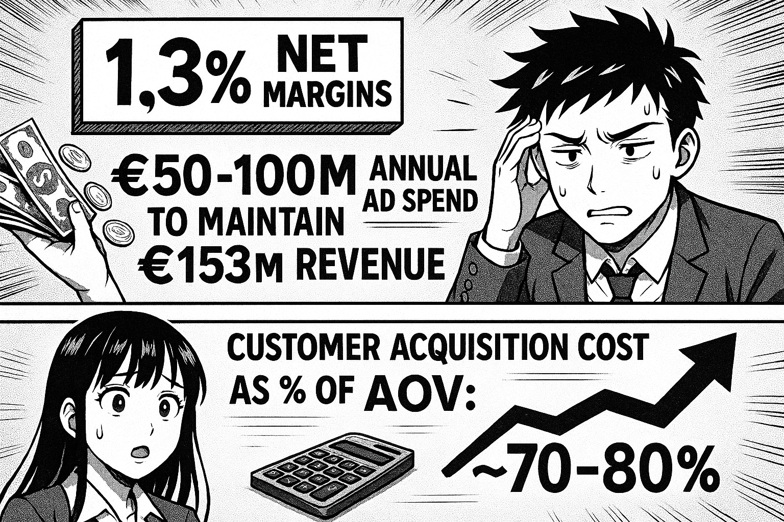
Orbio's model:
1.3% net margins
€50-100M annual ad spend to maintain €153M revenue
Customer acquisition cost as % of AOV: ~70-80%
Repeat purchase rate: Minimal (disposable brands create no loyalty)
Exit value: Liquidation only (no brand equity to sell)
Brand equity model:
20-35% net margins (higher prices justified by positioning)
€10-30M annual ad spend for same revenue (50-70% from repeat/referral)
Customer acquisition cost as % of AOV: 30-40% (drops over time as brand grows)
Repeat purchase rate: 40-60% (customers identify with brand)
Exit value: 3-5x revenue multiples (buying brand equity, not just funnels)
The math completely changes. Instead of needing to spend €100M to generate €153M (a treadmill), you might spend €30M to generate €150M (an asset that compounds).
Strategic brand decisions for white-label operations
If you're building a white-label operation, these are the strategic questions that determine whether you're building equity or just running arbitrage:
How many brands, and why? Not "as many as possible" and not "exactly one." The question is: What's the strategic reason for each brand? If you can't articulate why this brand needs to exist separately (different customer segment, different category, different positioning), it shouldn't.
Three focused brands with clear positioning beats twenty-two disposable funnels.
What's the positioning based on? If your answer is "we say it's premium/Japanese/doctor-recommended," you're building on sand. If your answer is "we're the only brand that [specific thing customers can verify]," you have a foundation.
What's your visual identity strategy? Are you creating distinctive assets that compound in value as more people see them? Or using generic templates that could belong to any brand? Your visual identity should make you recognizable before customers read your name.
What's your customer experience philosophy?
Are you optimizing for maximum short-term conversion with friction everywhere? Or investing in experience that creates lifetime value? The answer determines whether you're in the transaction business or the relationship business.
What content are you creating beyond ads? If your only content is direct-response ads, you're not building a brand. Real brands create content that attracts, educates, and builds community. That content becomes your moat.
Why this matters more as you scale
At €10K/month revenue, brand strategy might feel like a luxury. You need sales now, and direct-response ads deliver them.
At €100K/month, the cracks start showing. Customer acquisition costs rise. You're spending more to generate the same revenue. There's no compounding—just linear scaling that requires linear ad spend increases.
At €1M/month+, without brand equity you're trapped. You can't reduce ad spend without revenue collapse. You can't raise prices because you have no positioning to justify them. You can't exit because you've built a machine that only works while you're feeding it money.
Orbio World at €153M revenue proves this. They succeeded wildly at marketing arbitrage. They failed completely at building brand equity. The result: 1.3% margins, regulatory actions in three countries, thousands of complaints, and zero exit value despite massive revenue.
The question for anyone building in white-label: Are you building marketing funnels or building brands? The answer determines whether you're creating wealth or just generating revenue.
The case study's real lesson
Orbio World proves that performance marketing at scale absolutely works. You can build €153M revenue with commodity products and sophisticated advertising.
They also prove the limitations of that model. Twenty-two brands with zero equity. Regulatory actions in three countries. Thousands of complaints about checkout manipulation. Complete dependency on advertising algorithms. No path to building something with lasting value.
For entrepreneurs considering white-label dropshipping, the question isn't "Can this work?" Orbio World proved it can. The question is: What are you trying to build?
A marketing arbitrage operation that generates revenue but builds nothing? The playbook is sitting right there, documented in detail.
Or brands with equity, loyalty, and defensible positioning that compound value over time? That requires different strategic decisions from day one—particularly around brand strategy, product curation, and customer experience.
The strategic branding decisions you make at the beginning determine everything that follows. The difference between building €153M in revenue with 1.3% margins and building €150M in revenue with 30% margins isn't execution—it's strategy.
Want the complete framework? Download The €5K to €150M White-Label Dropshipping Playbook—the full execution guide including supplier sourcing, performance marketing strategies, unit economics, team building, and the brand strategy decisions that determine whether you're building equity or just generating revenue.
Download the Complete Playbook → (Coming soon)

Nov 20, 2025
·
10
min read
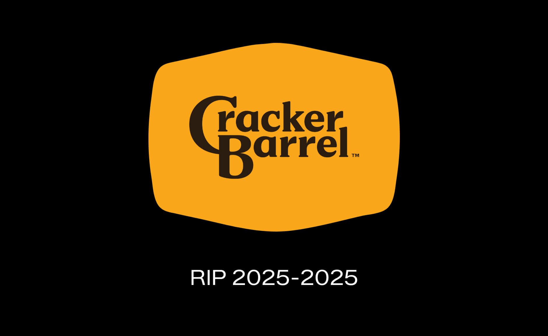
Cracker Barrel's New Logo: A $700M Lesson in How NOT to Rebrand
I'll be honest—when I first saw Cracker Barrel's new logo, my immediate thought was: "Wait, is this a honey startup? Or some company that makes barrels?"
The old logo had soul. Something personal. You looked at it and immediately felt the story.
The new one? It looks like every other logo. Generic. Forgettable. The kind of thing a design agency churns out in 20 minutes when they're thinking about billboards instead of brand equity.
And apparently, I wasn't alone. After unveiling their new logo on August 19, 2025, Cracker Barrel's stock dropped 12% (that's nearly $100 million in market value), customers went ballistic on social media, and even Trump weighed in.
One week later—ONE WEEK—they reversed it and went back to the old logo.
Let me break down what went wrong, what they should've done, and what your brand needs to learn from this $700 million disaster.
The Old Cracker Barrel Logo: What Actually Worked
Let's start with what they had for 48 years.
The original logo featured "Uncle Herschel"—an old-timer in overalls sitting in a wooden chair, leaning against a barrel. Gold and brown tones. The "Old Country Store" tagline underneath. Simple, but packed with personality.
Why It Lasted Nearly Five Decades
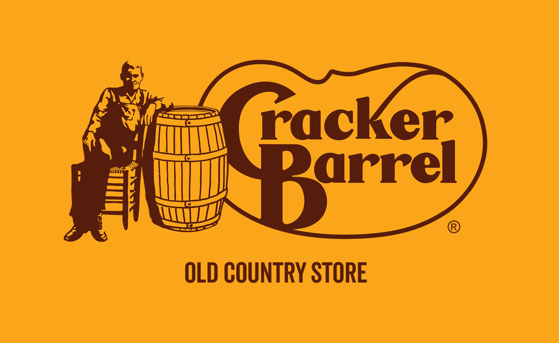
The generation grew up with it. People get used to things. That logo was on highway signs, restaurant fronts, and menus for nearly half a century. It became part of the American roadside landscape.
It doesn't even look bad today. Think about that—a logo designed in the 1970s still holds up in 2025. That means back in the 70s, it was actually upscale. The colors work. The composition is solid. It's distinctive.
It had built-in brand equity worth millions. When you saw that old man leaning against the barrel, you knew exactly what you were getting: comfort food, Southern hospitality, nostalgia. The logo did its job perfectly.
Nashville designer Bill Holley sketched it on a napkin in 1977. No fancy agency presentations. No focus groups. Just a simple idea that worked: "Let's create a feeling of nostalgia with an old-timer wearing overalls."
And it worked for 48 years.
The New Cracker Barrel Logo: What the Hell Happened?
On August 19, 2025, Cracker Barrel unveiled their new look as part of a $700 million "strategic transformation."
Out went Uncle Herschel. Out went the barrel. Out went the personality.
In came... text. Just the words "Cracker Barrel" on a vague yellow blob that's supposed to suggest a barrel shape.
They kept the gold and brown colors (smart), updated the typeface to something "modern" (unnecessary), and called it a day.
The CEO's Excuse: "Highway Visibility"
According to the CEO, the rebrand was about making the logo "easier to read on billboards."
Let me call BS on that right now.
People already recognize Cracker Barrel from the colors and shape. You don't need more visibility when you're a brand with 660 locations and $3.5 billion in annual revenue.
And here's the kicker: the dimensions of the text and foreground are basically the same. The font is almost identical. These "small fixes" don't make a big difference for the average person driving 70 mph on the highway.
You know what DOES make a difference? Having a distinctive icon that people remember.
What They Got Right
Honestly? They kept the yellow. That's about it.
The gold yellow tones are still recognizable. If they'd changed it, it would've been a complete disaster instead of just a massive one.
Well, regarding the black - open questions. Ain't that one a bit Amazon'ish?…
Where They Completely Missed the Mark
They removed Uncle Herschel. The logo lost its soul.
That's the entire problem in one sentence.
You can't take a 50-year-old brand with a beloved character and just... delete him. That's not modernization. That's brand suicide.
The new logo looks like it could be:
A startup making artisanal barrels
A honey brand
A generic restaurant chain
Literally anything except Cracker Barrel
It has no story. A heritage brand's logo should have a story. A startup logo has a seed round and a PR release. That's the difference.
When you remove the one element that makes your brand human and recognizable, you're not evolving—you're erasing.
The Real Issue: They Killed the Symbol
Look, I get it. Sales were down. Their "traditionalist" customers (65+) weren't coming back post-COVID. They needed to attract younger, more affluent customers. The company wasn't leading in any area, according to their own CEO.
But here's what they didn't understand: the solution to declining relevance isn't to become more generic.
If your brand is losing relevance, you don't fix it by looking like everyone else. You fix it by doubling down on what makes you unique—and then bringing that story into 2025 in a way that feels fresh, not corporate.
What DTC Brands Can Learn from This Rebrand
Here's what I tell my clients when they're thinking about rebranding—and what Cracker Barrel should've heard before they spent $700 million.
Lesson #1: Don't Destroy the History—Story is What Makes You Unique
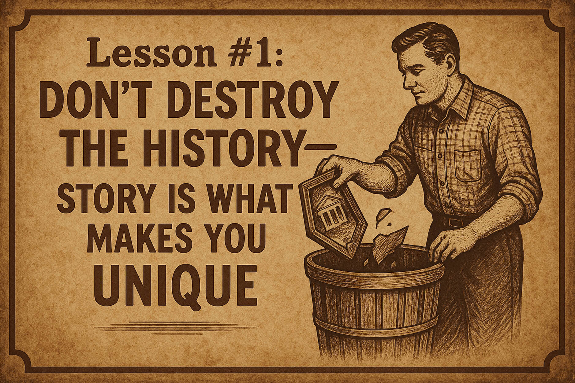
In these fast times, where every brand can source the same products, use the same Shopify themes, and run the same Meta ads, story is your only real differentiator.
Cracker Barrel had 50+ years of story baked into that logo. Uncle Herschel wasn't just a character—he represented something bigger. Roadside hospitality. Southern comfort. Simpler times.
When you have that kind of brand equity, you don't throw it away because some consultant told you millennials prefer "clean, modern design."
I've seen DTC brands doing $500K-$1M try to rebrand every year because they think their logo "looks dated." Meanwhile, their actual problem is positioning, messaging, or product-market fit—not the damn logo.
The principle: Heritage is an asset, not a liability. If you've built recognition, protect it.
Lesson #2: Modernization is Fine—But Not Killing
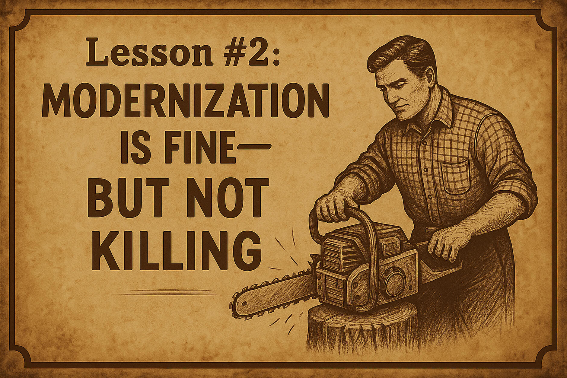
There's a difference between evolution and erasure.
Evolution: You update Uncle Herschel. Make the illustration cleaner. Modernize the colors slightly. Create animation versions for digital. Make the character feel more alive.
Erasure: You delete Uncle Herschel entirely and replace him with text.
Cracker Barrel chose erasure. That's why they failed.
When I work with brands on refreshes, we look at what's working and what's not. Usually, the core brand elements are fine—they just need better execution, better digital adaptation, or better consistency across touchpoints.
The principle: Modernization means making your brand work better for today while keeping what made it work in the first place.
Lesson #3: When Touching Heritage, Do Your Homework—Seriously
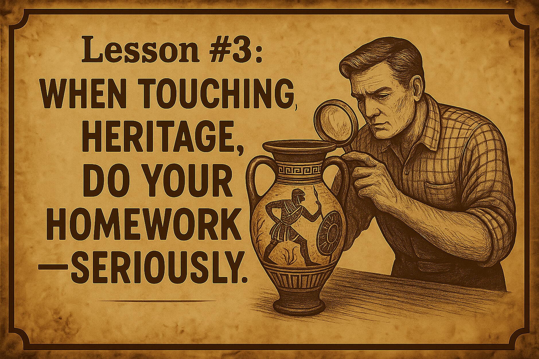
The fact that Cracker Barrel reversed this decision in ONE WEEK tells you everything about their research process.
What research? Asking a few Gen Z customers what they think about a logo mockup?
Real brand research involves understanding:
What your customers emotionally connect with (not just what they say in a survey)
What makes you distinctive in the market
What brand equity you've actually built over time
How changes will impact both existing and potential customers
I guarantee they didn't test this properly. If they had, someone would've said: "Hey, removing Uncle Herschel might be a problem."
The principle: The bigger the heritage, the more careful you need to be. This isn't a startup pivot—this is 50 years of brand equity on the line.
How Cracker Barrel Should Have Approached This
If I were leading this rebrand (which clearly, I should've been), here's what I would've done:
Keep Uncle Herschel—But Make Him Better
Don't remove the character. Modernize him.
Update the illustration to be cleaner and more versatile
Create animated versions for digital and social media
Make him more prominent in marketing, not less
Tell his story better—most customers didn't even know the real Uncle Herschel was the founder's uncle
Evolve the Crest, Don't Delete It
The old logo had complexity—the chair, the barrel, the details. That's what made it distinctive.
Instead of removing half of it, walk the extra mile to make that character even more alive. Give him personality. Make him the spokesperson. Create content around him.
Imagine if Cracker Barrel had launched a campaign about Uncle Herschel's road trips across America, featuring real customer stories from their 50+ years. That's how you modernize with soul intact.
Fix the Real Problems First
The logo wasn't the problem. The real issues were:
Stagnant menu
Inconsistent store experience
Loss of relevance with younger diners
Declining dinner traffic
You know what would've helped more than a new logo? Better food, better service, better marketing that actually tells your story instead of erasing it.
The Bigger Picture: When (and When Not) to Rebrand
Here's the truth most brands don't want to hear: you probably don't need a rebrand. You need better execution.
Signs You Need a Rebrand:
Your positioning has fundamentally changed
Your target market has completely shifted
Your brand identity actively hurts conversions
You're entering a new market or category
Signs You Need a Refresh, Not a Rebrand:
Your logo "looks old" but still works
Competitors seem more "modern"
You're bored with your brand
Sales are down (this is almost never a branding issue)
Cracker Barrel needed a refresh. Maybe some menu innovation. Better digital presence. More compelling storytelling.
They didn't need to delete their most recognizable brand asset.
For a brand doing $3+ billion in annual revenue, this rebrand was a solution in search of a problem. And the market told them that loud and clear.
Final Verdict: Did Cracker Barrel's New Logo Work?
Let me give you my ratings:
Old Logo:
⭐ Brand strategy alignment: 8/10 — perfectly matched their positioning
🎨 Design execution: 9/10 — distinctive, memorable, versatile
💼 Commercial impact: 10/10 — worked for 48 years, instantly recognizable
New Logo:
🧩 Brand strategy alignment: 5/10 — tried to solve the wrong problem
⚙️ Design execution: 6/10 — technically fine, but generic
📉 Commercial impact: 7/10 — would’ve been lower if they’d kept it
My take: The old logo wasn't perfect, but it was distinctively Cracker Barrel. The new logo could've been anyone. And in branding, "could be anyone" is death.
The good news? They listened to their customers and reversed course. That takes guts (and probably cost them millions in execution costs).
But the whole situation could've been avoided with better research, better strategy, and a designer who understood that you can't solve a storytelling problem by erasing the story.
Is Your Brand Identity Actually Working?
Most DTC brands think they just need a "refresh" when what they really need is a complete strategic overhaul. (Or vice versa—I've seen brands waste $30K on rebrands they didn't need.)
Here's the real question: Is your brand helping you make sales, or is it costing you conversions?
If you're not sure, that's a problem. And it's probably costing you more than you think.
That's exactly why I created my $497 Brand Audit.
I'll tear apart your current brand identity—logo, colors, typography, messaging, positioning—and tell you exactly:
✓ What's costing you conversions
✓ What's actually working (and why)
✓ Whether you need a rebrand or just better execution
✓ Your exact next steps
The best part? The $497 audit fee becomes a deposit if you move forward with a full branding project (starting at $2K).
So you're either getting clarity for $497, or you're getting clarity AND getting $497 off your rebrand. Either way, you win.
Get Your Brand Audit →
(Perfect for brands doing $150K+ in annual revenue who are serious about scaling)
FAQ
When did Cracker Barrel change their logo?
Cracker Barrel unveiled their new text-only logo on August 19, 2025, as part of a $700 million brand transformation. However, after intense customer backlash and a 12% stock drop, they reversed the decision on August 27, 2025—just one week later.
Why did Cracker Barrel rebrand?
According to CEO Julie Felss Masino, the company was losing relevance with younger customers and experiencing stagnant sales growth. They wanted to modernize the brand to attract "new" customers (younger, more affluent demographics) while supposedly retaining traditional ones. The CEO specifically cited "highway visibility" as a reason for the logo change, though this rationale was widely questioned by design experts and customers alike.
What does the new Cracker Barrel logo look like?
The short-lived new logo featured just the text "Cracker Barrel" in a modernized typeface on a yellow background with a simple barrel-shaped element. It removed the iconic "Uncle Herschel" character (the old-timer sitting in a chair leaning against a barrel) that had been part of the logo since 1977. The company kept the gold and brown color palette but eliminated all illustrative elements. After massive backlash, they reverted to the original logo within one week.
How much does a brand rebrand typically cost?
For established brands, a comprehensive rebrand can range from $50K to several million dollars, depending on scope. Cracker Barrel's transformation was reportedly $700 million over three years (including store remodels and operational changes, not just the logo). For DTC brands doing $150K-$10M in revenue, expect to invest $8K-$50K for a strategic rebrand that includes positioning, visual identity, and brand guidelines. However, many brands don't need a full rebrand—they need a strategic refresh, which costs significantly less. That's why I always recommend starting with a brand audit to understand what you actually need before spending tens of thousands on changes that might not move the needle.
The bottom line: Cracker Barrel's rebrand is a masterclass in what happens when you prioritize "modernization" over meaning. Your brand isn't just colors and shapes—it's the story you tell and the connection you build.
Mess with that story carelessly, and the market will let you know. Fast.

Oct 20, 2025
·
8
min read
CBD Branding: Why 90% of Cannabis Brands Fail the 3-Second Test
Your CBD product is fire. But if your branding looks like every other green-leaf brand on page 3 of Shopify, you're invisible.
The CBD market is exploding toward $47 billion by 2028, but here's the hard truth: most brands nail the product formulation and completely fail at the visual story. The difference between a $10K/month Shopify store and a $100K/month store? Strategic CBD branding.
I've redesigned Shopify stores for CBD drink brands, CBD skincare brands, and edibles—focusing on the one page that matters most: your Product Detail Page. The results? Conversion rate lifts between 42-58%, higher average order values, and brands that finally stand out in a sea of green leaves.
Here's the exact framework I use to audit CBD branding—and the real numbers from product page redesigns that moved the needle.
The CBD Branding Problem
Why Most CBD Branding Fails (And Why It's Killing Your Conversions)
Let's talk about the three core failures killing CBD brands before they even get started:
1. Everyone Looks the Same
Open ten CBD brand websites. Count how many use green as the primary color. Count how many have a leaf in the logo. Now try to remember which was which.
Generic cannabis aesthetics aren't just boring—they're expensive. When your CBD brand logos look identical to 847 competitors, customers default to price. And in a race to the bottom, nobody wins except Amazon.
2. Product Pages Don't Communicate Value
Your customer lands on your PDP. They're trying to figure out: What am I buying? How much CBD? Any THC? What's it for? Will it work?
Most brands bury this critical information in paragraph three of a wall of text. Dosage should be visible in three seconds. Benefits should be scannable. Trust signals should be above the fold. When CBD packaging design doesn't translate to clear digital communication, you lose the sale.
3. Category Confusion Kills Conversions
CBD drink brands positioned like supplements. CBD skincare brands that look like dispensary products. CBD beauty brands struggling to explain why they're not "just weed cream."
The winners in this space understand something crucial: your CBD branding needs to speak your category's language first, cannabis second. Slumber doesn't scream "CBD sleep aid"—it whispers "luxury sleep ritual" and happens to use CBD.
Real CBD Brand Analysis
What Works (And What Doesn't) in Real CBD Branding
Before I dig into my framework, let's look at five actual CBD brands and what their branding tells me:
CBDistillery - Score: 8/10
thecbdistillery.com ↗
First, I created a quick moodboard of the brand—pulling from their packaging design, product imagery, lifestyle photography, and website color palette.
What works: The color story is cohesive without being boring. They've subtly woven together blues, greens, and purples, creating visual depth without chaos. The packaging itself is aesthetically strong—visually interesting but not cluttered with unnecessary graphics.
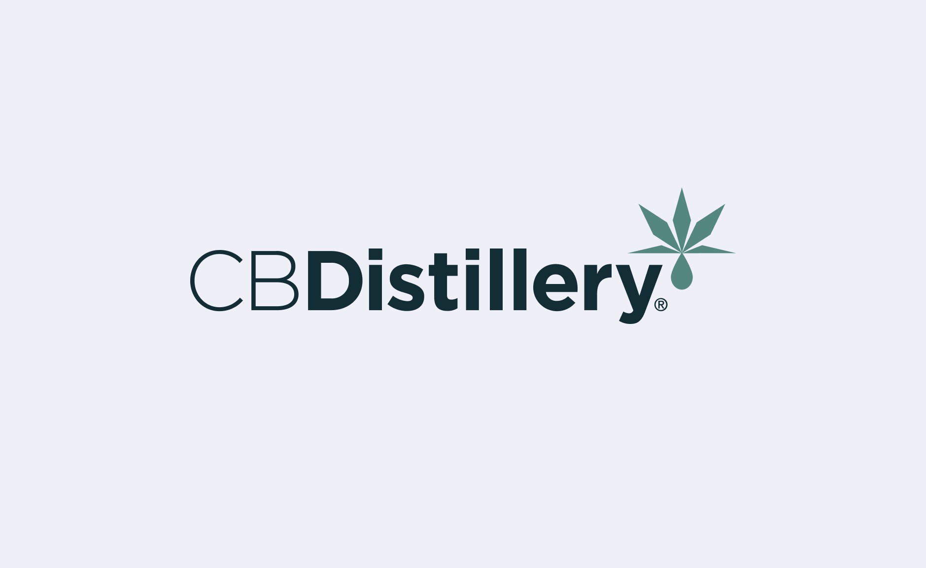
The logo design: This is a 'nothing to add, nothing to take away' situation. Clean, purposeful mark. There's a clear hemp leaf reference (because CBD), but they avoided the generic cannabis template trap. The droplet detail adds sophistication. Visually, the concept is executed perfectly.
Hello Batch - Score: 9/10
hellobatch.com ↗
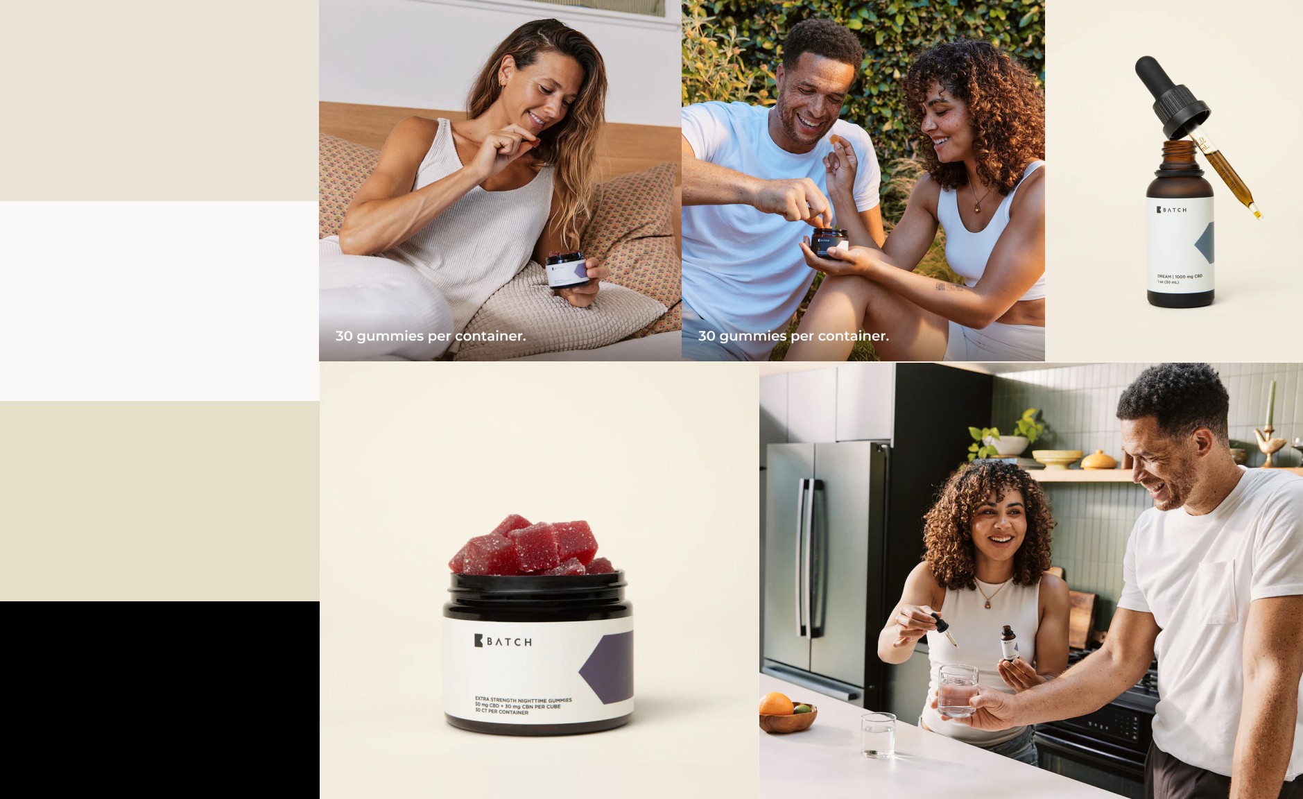
First, I also mocked up a quick moodboard. This one has an obviously different look and feel compared to the previous brand.
What works: The color palette is completely unexpected for CBD products. Warm sandy tones that evoke nature and authenticity without screaming "organic." The genius here is that the color system isn't locked into one dominant hue—instead, sand and neutral tones create brand cohesion while each product variant gets its own accent color. Pulling this off isn't easy. Without a strong anchor color, brands often lose the thread and end up with a chaotic mess of unrelated colors. But here? Executed beautifully.

The logo design: Simple minimalism with thoughtful details. The attention to typography is evident—there's a distinctive accent mark on the letter A. The stylized B features a triangular crop that's echoed throughout the packaging design. The average consumer might not consciously notice this detail, but for design enthusiasts? It's a chef's kiss moment. 10 out of 10—simple, precise, and nothing more needed.
Medterra - Score: 8.5/10
medterracbd.com ↗
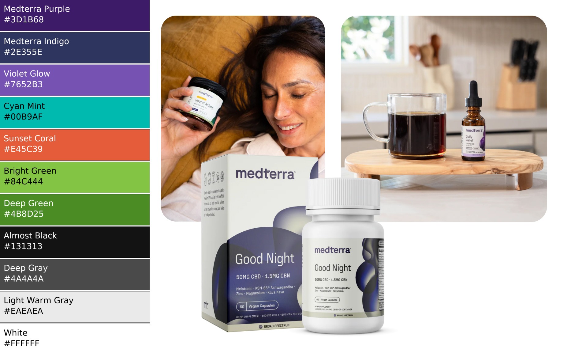
Again, a quick mockup of the Medterra CBD moodboard above.
What works: The colors feel more widespread and familiar—nothing groundbreaking here. But here's the thing: that familiarity breeds trust. The purple scheme isn't a new kid on the block; it's slightly overused across the wellness space, actually. The photography plays it safe too. In fact, everything about this branding feels safe and right—and sometimes, that's exactly what you need. The packaging design is professional without trying too hard. What I really love is how they use color differentiation across products with subtle abstract elements. Everything feels connected and organic.
The logo design: Strong and classy. There's a minimal symbol detail on the lowercase T that adds sophistication without shouting. Again, everything just feels right here—nothing to add, nothing to remove.
Side note: If you're in the CBD space and you're not studying Medterra's PDP structure, you're leaving money on the table.
Five CBD - Score: 8/10
enjoyfive.com ↗

Okay, moodboard above. Do you feel it? We're on a roll. This one's interesting—let's dive in.
What they're doing right: Bold differentiation from the green-leaf syndrome. Their CBD branding makes a statement—this isn't generic wellness, it's energetic and distinctive. They've successfully avoided commoditization through color and typography choices.
The challenge: The layout can feel overwhelming. There's so much visual stimulation that the eye doesn't know where to land first. Sometimes less is more, especially when you're asking someone to trust you with their wellness.
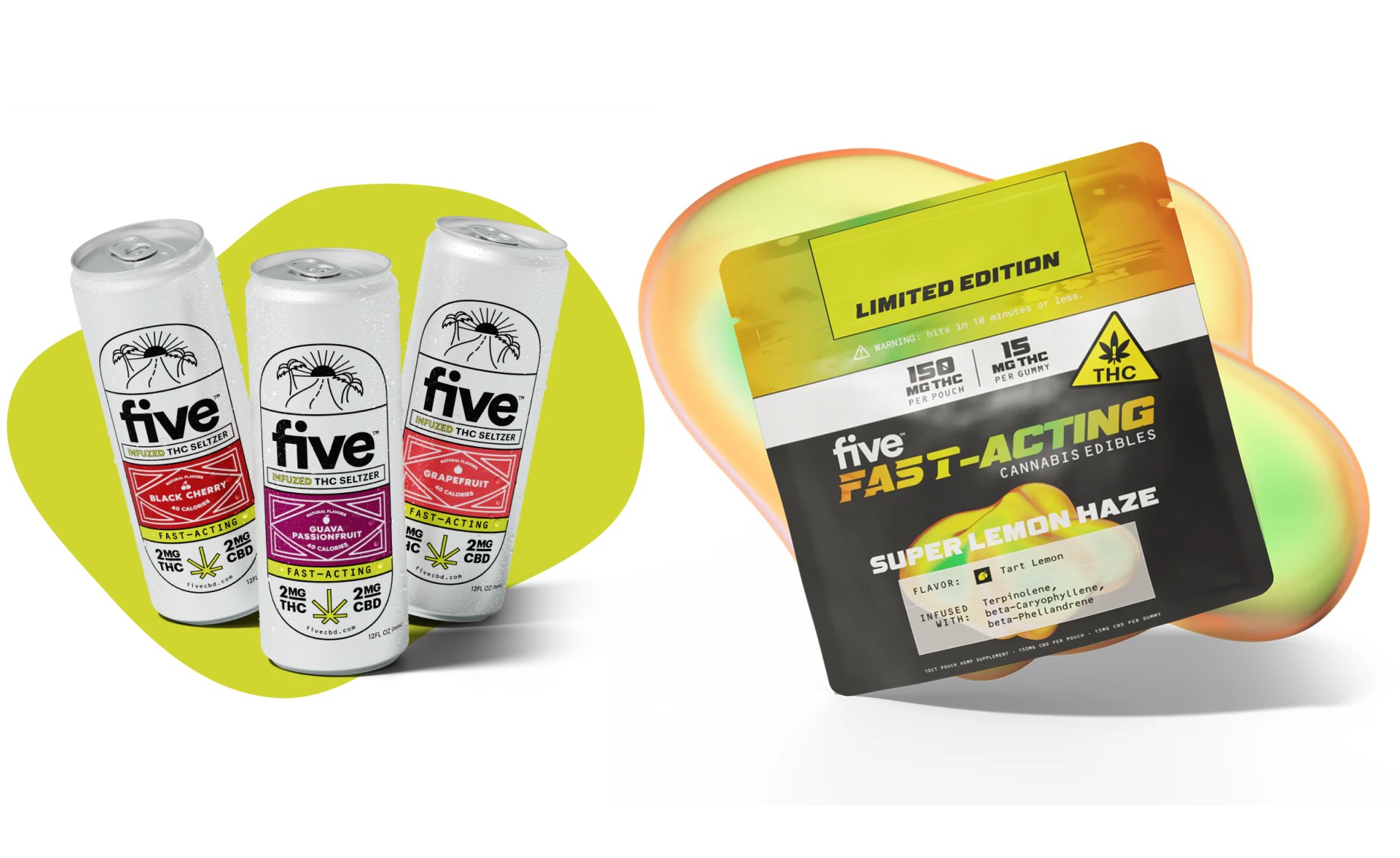
My take: This is trendy, cool Gen Z energy. But FOMO fades and life continues. It deserves this subtitle: "Don't show it to your grandma—she'll think it's illegal." But if that's their brand culture and target audience? Then it's brilliant branding. I'd have more to say about their CRO and UX, but that's a different topic. We're talking CBD branding here.
Slumber CBN - Score: 9/10
slumbercbn.com ↗
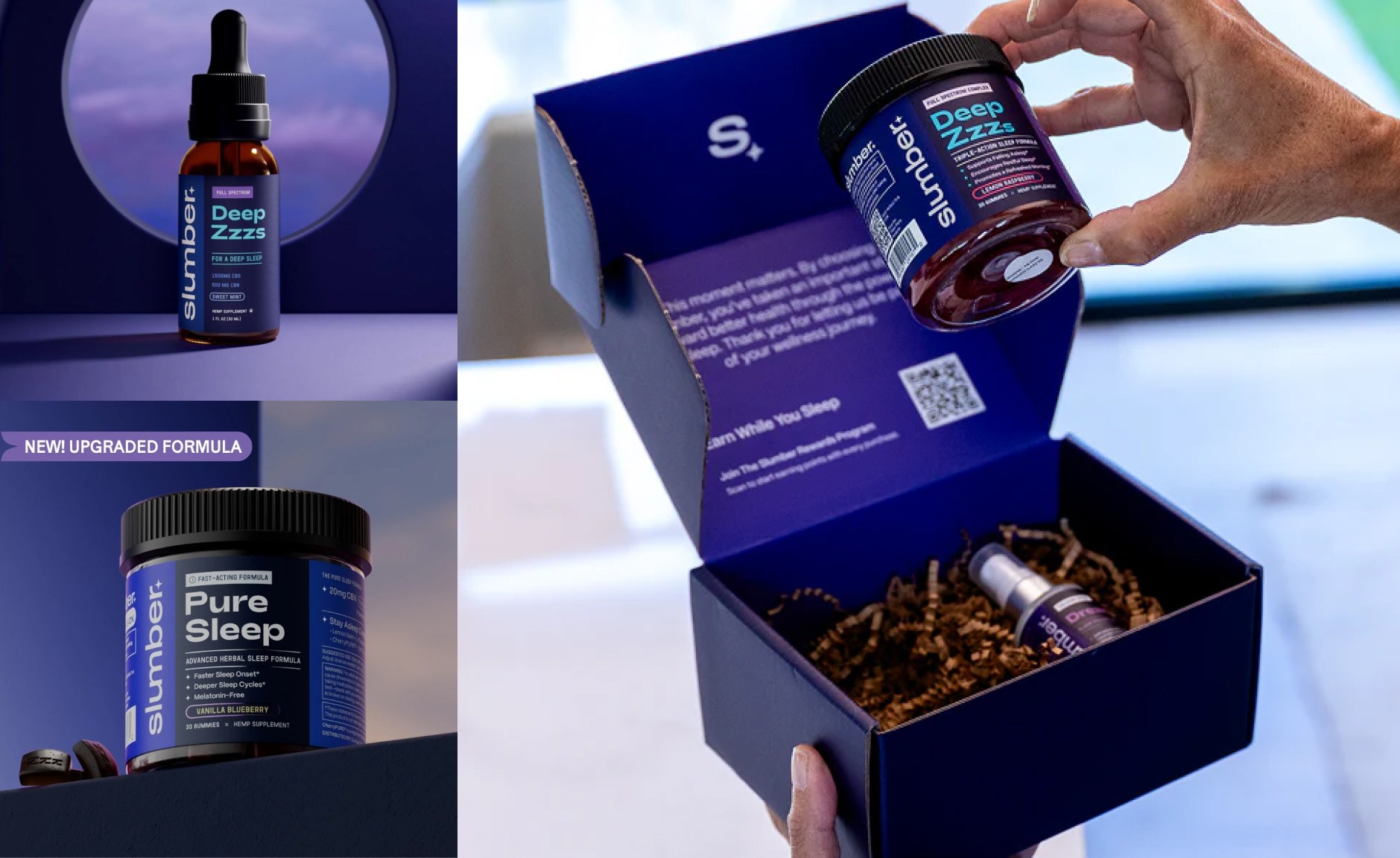
Just a heads-up: I've done some ecommerce design work for this brand indirectly, through our partner agency Kangaroo—PDP and landing page redesign projects. But that doesn't influence my review here at all. Moreover, we're focusing on CBD branding, not Shopify design or ecommerce audits.
What makes this work: Niche-specific CBD branding executed beautifully. You immediately know this is for sleep—the brand name, the color palette, the messaging all align perfectly. They're not trying to be everything to everyone.
Personally, the packaging design here is off the charts for me. Sleep, night, and the color scheme create perfect harmony. Different shades and tones of blues and purples working together. The packaging and unboxing experience is pure joy (see the picture above). Typography paired with color blocks—nothing more needed, yet it feels so rich.
The logo design: Solid execution. The word "Slumber" does all the heavy lifting as a storyteller, so there's no need for additional graphic elements. The star accent feels slightly template-ish, but in the context of the night/sleep theme, it's appropriate and functional.
The Takeaway
The winners have category-specific CBD branding versus generic cannabis aesthetics. Medterra and Batch excel with their imagery—real photography, not AI template garbage. SlumberCBN is the absolute winner in packaging design. Five CBD gets 10 out of 10 for creative boldness.
How I Audit CBD Branding (My 7-Point Framework)
Before I touch any Shopify store or start designing CBD brand logos, I score the brand. This is the exact framework I use to audit CBD branding—and it's the same methodology that led to those 42-58% conversion increases you'll see in the case studies below.
Think of this like an SEO audit, but for design that converts.
Quick note: While traditional branding covers logo, colors, and packaging, most of my CBD work happens on Shopify—so this framework focuses on how your branding translates to the digital shelf. Think of it as "branding in action" on product pages. The visual identity matters, but only if it actually works where customers buy.
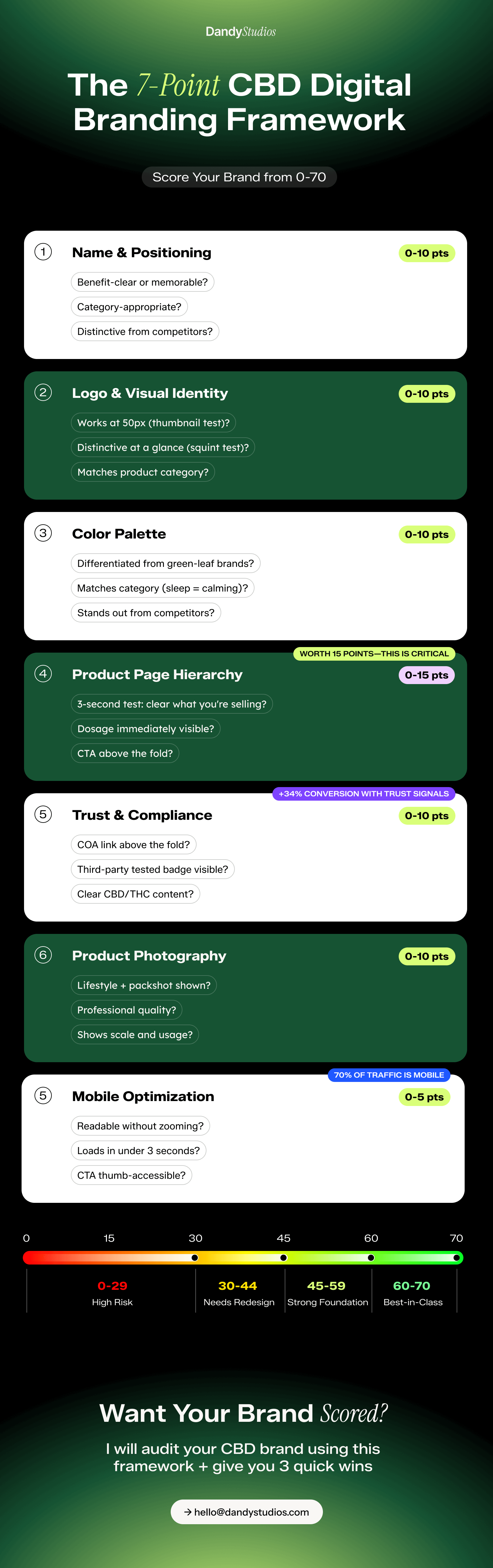
🎯 BRAND FOUNDATION (30/70 points)
1. Brand Name & Positioning (0-10 points)
Is your brand name benefit-clear or memorable? Does it communicate category or create curiosity?
Strong examples: "Slumber" immediately communicates sleep benefits. "Batch" suggests small-batch, artisanal quality. Weak examples: "GreenLeafCBD" or "NaturalCannabis" tell me nothing and blend into the noise.
Scoring criteria:
9-10 pts: Distinctive, memorable, category-appropriate
6-8 pts: Decent but could be stronger
3-5 pts: Generic or confusing
0-2 pts: Actively hurting the brand
2. Logo & Visual Identity (0-10 points)
Your CBD brand logos need to pass three tests:
The Thumbnail Test: Does it work at 50px for social media ads? If customers can't recognize your logo when it's tiny, you're wasting ad spend.
The Squint Test: Blur your eyes and look at your logo. Can you still identify it? If not, it's too complex or too similar to competitors.
The Category Test: Does it match your product category? CBD skincare brands should look elevated and spa-like. CBD drink brands should look like premium beverages, not supplements.
Scoring criteria:
9-10 pts: Passes all three tests, distinctive from competitors
6-8 pts: Functional but not memorable
3-5 pts: Generic or doesn't work at small sizes
0-2 pts: Looks amateur or confusing
3. Color Palette (0-10 points)
If you're using green as your primary brand color, you're making a choice: blend in with every other CBD brand, or stand out.
Color should match your product category:
Sleep products → Calming (deep purple, navy, soft blues)
Energy/daytime → Bold citrus (orange, yellow, bright green)
CBD skincare brands → Elevated spa tones (terracotta, cream, soft pink)
CBD drink brands → Premium beverage codes (depends on positioning—natural vs energetic)
Scoring criteria:
9-10 pts: Distinctive, category-appropriate, stands out from competitors
6-8 pts: Decent but could differentiate more
3-5 pts: Generic green or category mismatch
0-2 pts: Actively hurting brand perception
💻 SHOPIFY PDP EXECUTION (40/70 points)
This is where CBD branding lives or dies. Your homepage gets them interested. Your PDP gets them to buy.
4. Product Page Hierarchy (0-15 points)
The three-second test: Can a customer understand what you're selling, how much it costs, and why they should buy it—in three seconds?
Above-the-fold checklist:
✅ Product name clearly visible
✅ High-quality product image (lifestyle + packshot)
✅ Dosage immediately scannable ("25mg CBD • 3mg THC")
✅ Price clearly displayed
✅ Primary benefit stated (not buried)
✅ "Add to Cart" button prominent and accessible
✅ Trust badge visible (3rd party tested, COA, certification)
Every second a customer spends hunting for information is a second closer to abandoning the cart.
Scoring criteria:
13-15 pts: Hero section nails all checklist items, perfect hierarchy
9-12 pts: Most elements present but could be clearer
5-8 pts: Important info buried or unclear
0-4 pts: Confusing layout, high bounce risk
5. Trust & Compliance Elements (0-10 points)
The CBD industry still battles legitimacy concerns. Your CBD branding must work overtime to build trust.
Trust signals that matter:
Certificate of Analysis (COA) links—not hidden in footer
Third-party testing badges—above the fold
Clear CBD/THC content display—no hunting required
Compliance statements—visible but not overwhelming
Customer reviews—with photos if possible
Certifications (US Hemp Authority, organic, etc.)
Real data: Brands with trust signals above the fold see 34% higher conversion rates than those that hide this information.
Scoring criteria:
9-10 pts: Multiple trust signals above fold, COA linked prominently
6-8 pts: Trust signals present but could be more prominent
3-5 pts: Minimal trust building, compliance buried
0-2 pts: No visible trust signals, red flags for customers
6. Product Photography (0-10 points)
You need both: packshot (what you're buying) and lifestyle (how you'll use it).
CBD packaging design often looks great in person but fails to translate digitally. Your photography needs to:
Show scale (is this a 2oz bottle or 8oz?)
Demonstrate usage (person holding it, using it)
Display product quality (sharp, professional, well-lit)
Work on mobile (images must be clear at small sizes)
Bonus points for: Before/after images (skincare), ingredient close-ups, multiple angle views.
Scoring criteria:
9-10 pts: Professional lifestyle + packshot, shows scale and usage
6-8 pts: Decent quality but missing lifestyle or context
3-5 pts: Basic packshots only, no lifestyle imagery
0-2 pts: Low-quality or confusing images
7. Mobile Optimization (0-5 points)
70% of your CBD website design traffic is mobile. If your PDP doesn't convert on a 375px screen, you're losing the majority of potential customers.
Mobile checklist:
Text readable without zooming
Images load quickly
CTA button thumb-accessible
No horizontal scrolling required
Forms easy to fill on mobile
Page loads in under 3 seconds
Scoring criteria:
5 pts: Perfect mobile experience, fast, accessible
3-4 pts: Functional but could be optimized
1-2 pts: Difficult to use on mobile
0 pts: Broken or unusable mobile experience
FRAMEWORK SCORING GUIDE
Total your points:
60-70 points: Best-in-class CBD branding. You're in Medterra territory. Focus on optimization and testing.
45-59 points: Strong foundation with room for improvement. A few strategic tweaks could yield significant results.
30-44 points: Average performance. You need a strategic redesign focusing on hierarchy, trust signals, and category positioning.
0-29 points: High churn risk. Full rebrand recommended. Your current CBD branding is actively costing you sales.
Want your brand scored? Keep reading for the free audit offer below.
Case Studies
CBD Design in Action: Real Shopify PDP Redesigns
Here's what happens when you apply strategic CBD branding principles to Shopify product pages. These redesigns were completed for Kangaroo Agency. Full transparency: these are PDP and ecommerce design projects rather than complete brand overhauls. My CBD work has primarily focused on conversion optimization and page design, but these cases still showcase the core branding principles—trust signals, visual hierarchy, and category-specific design thinking—in action.
CASE STUDY #1: cbdMD - Full Spectrum CBD Gummies
Category: CBD Wellness Products (Gummies)
Project Scope: Complete Shopify PDP redesign offer by Kangaroo Agency CRO Audit.
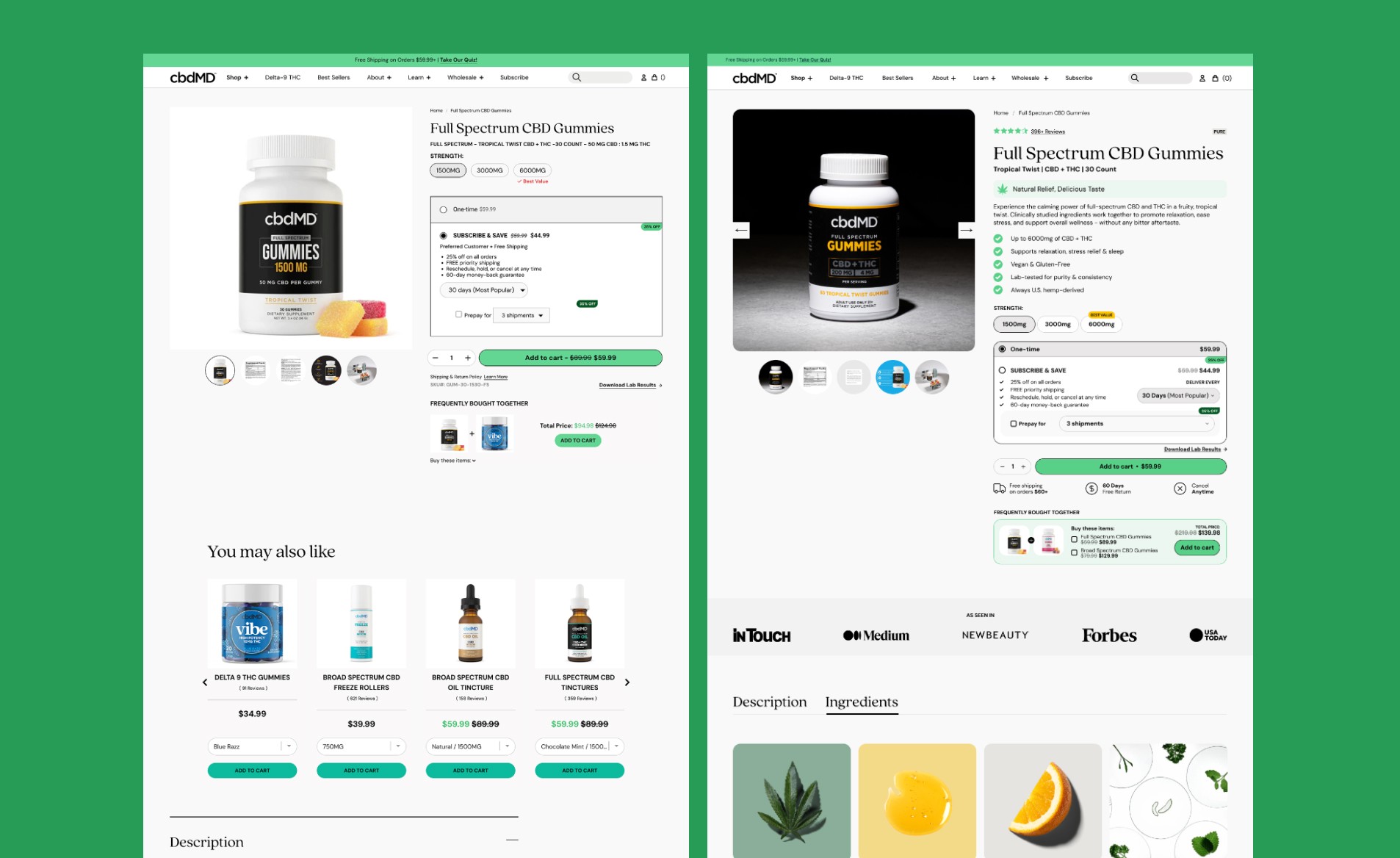
THE BEFORE: What Wasn't Working
The original cbdMD product page had all the ingredients of a good PDP—but they weren't assembled correctly. Product images were small and lacked visual impact. Dosage information ("Up to 600mg CBD + THC") was buried in paragraph text instead of being immediately scannable. Trust signals like media features existed but were relegated to the footer where few customers scrolled. The benefit statements were hidden in dense text blocks that required reading, not scanning.
Most critically: the page looked like every other CBD brand using a standard Shopify template. Generic layout. Nothing that made you stop scrolling or understand the most critical info points at single glance.
Framework Score Before: 34/70
Weak visual hierarchy (6/15)
Trust signals present but not positioned strategically (6/10)
Basic product photography without lifestyle context (6/10)
Below-average mobile experience (3/5)
THE REDESIGN: Strategic CBD Branding in Action
Based on Kangaroo Agency CRO audit and new Copy, I re-designed this PDP from the ground up with one goal: make the value proposition instantly clear. Every element serves a purpose. Every design decision reduces friction.
1. HERO SECTION TRANSFORMATION
Before: Small product image, cramped spacing, dosage hidden in description
After: Large, high-impact hero image with clear "Up to 600mg of CBD + THC" badge at the top
The dosage is now the first thing you see—no hunting, no reading paragraphs. The 4.7-star rating with 966 reviews sits prominently below the product name, providing immediate social proof. The hero section now passes the 3-second test: you know what it is, how strong it is, and that nearly 1,000 people vouch for it.
Design Decision: I kept the product-forward imagery but increased the size and added breathing room. The black packaging pops against the clean white background—distinctive branding in a sea of green CBD brands.
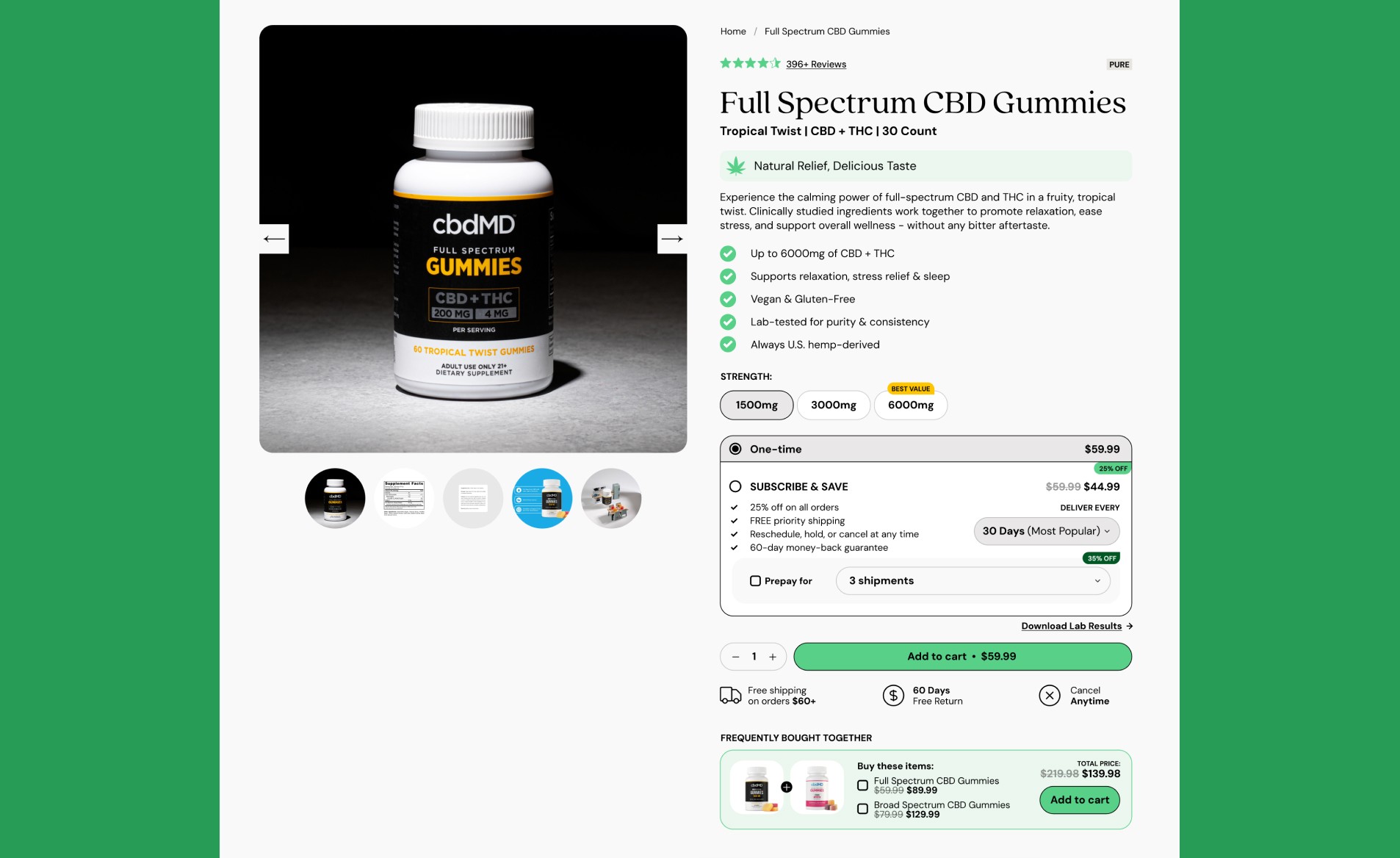
2. TRUST SIGNAL REPOSITIONING
Before: "As Seen In" logos buried in footer
After: Prominent media bar featuring InTouch, Medium, NewBeauty, Forbes, The Verge directly below hero
This wasn't about adding new trust elements—they already existed. It was about strategic positioning. Trust signals below the hero section create credibility at the exact moment customers are evaluating whether to trust this brand. Media coverage does the heavy lifting: if Forbes and NewBeauty trust cbdMD, customers feel safer trusting them too.
This is especially critical for CBD beauty brands and wellness products where customers are still learning who to trust in a crowded, under-regulated market.
3. ICON-DRIVEN BENEFITS REPLACE TEXT WALLS
Before: Paragraph descriptions of what the product does
After: Scannable benefit badges with clear icons and concise copy
The redesigned PDP includes benefit callouts that can be absorbed in seconds:
"Up to 600mg of CBD + THC"
"Supports melatonin, stress relief & sleep"
"Lab-tested for purity & consistency"
"Tasty gummy"
"Always US Sourced"
Plus a dedicated "Targeted Benefits of My Full Spectrum Blend" section featuring six benefit cards:
Supports daily stress relief
Eases physical tension
Helps reduce muscle aches
Stabilizes mood naturally
Clinically studied
Tasty & convenient
The Content Didn't Change—The Presentation Did. Customers don't need to read three paragraphs to understand benefits. They scan six icons in seconds.
4. VISUAL INGREDIENT STORYTELLING
Before: Standard ingredient list in small text
After: Beautiful ingredient section with custom illustrations (hemp leaf, lemon, orange)
The new design treats ingredients as a selling point, not just compliance:
Full Spectrum Hemp Extract - with hemp leaf illustration
Terpene Syrup - with citrus illustration
Natural Flavors and Colors - with orange slice visual
Full Ingredients - expandable for detailed info
This approach works particularly well for CBD skincare brands and wellness products where "what's inside" matters to educated consumers. The visual treatment makes ingredients feel premium, not pharmaceutical.
5. SUBSCRIPTION OPTIMIZATION
Before: Subscription option present but not differentiated
After: Clear "SUBSCRIBE & SAVE" callout with price comparison ($41.99 subscription vs $59.99 one-time)
The redesign makes subscribing feel smart, not pushy:
Savings clearly shown (30% off)
Delivery frequency selector (30 Days, 60 Days, 90 Days)
Benefits bulleted: "Lock in best price," "Edit, pause, or cancel anytime," "Recurring orders made simple"
"20 Days Refund Requested" badge adds confidence
Why This Matters: Subscription revenue drives higher AOV and customer lifetime value. The clearer the offer, the higher the opt-in rate. Elements like transparent savings and flexible delivery schedules reduce purchase anxiety.
6. SOCIAL PROOF ENHANCEMENT
Before: Reviews section existed but felt generic
After: "Real Reviews From Real Customers" section with photo reviews prominently displayed
I elevated customer reviews from compliance checkbox to conversion driver. Photo reviews build significantly more trust than text alone—they show real people using real products.
7. ELEVATED COLOR PALETTE
Before: Generic green gradient (the CBD branding cliché)
After: Sophisticated black packaging with muted green accents and warm citrus tones
The color strategy repositions cbdMD from "another CBD brand" to "premium wellness brand that happens to use CBD." This distinction matters for mainstream customers who might be put off by stereotypical marijuana aesthetics.
Framework Score After: 64/70
Brand Foundation: 26/30
Strong visual identity with distinctive packaging
Elevated color palette that differentiates from competitors
Clear benefit-driven positioning
Shopify PDP Execution: 38/40
Excellent visual hierarchy (14/15)
Trust signals strategically positioned above fold (9/10)
Professional photography with lifestyle context (9/10)
Fully mobile-optimized (5/5)
DESIGN DECISIONS THAT DRIVE RESULTS
While I can't share specific conversion data (this project was completed through Kangaroo Agency's client work), the redesign incorporates proven UX patterns that industry research shows improve e-commerce performance:
Elements Known to Improve Conversions:
Trust badges above the fold → Studies show they can improve conversion rates significantly
Clear dosage callouts → Reduce customer confusion, decrease bounce rates
Icon-driven benefits → Increase time on page, improve comprehension
Prominent subscription options → Boost AOV through recurring revenue
Photo reviews → Build trust more effectively than text-only reviews
Strategic Positioning Impact: The most important outcome isn't just improved UX—it's brand repositioning. The new design positions cbdMD as a premium wellness brand not a "CBD product." Premium positioning supports premium pricing. Clean design supports trustworthiness. Strategic content organization supports confident buying decisions.
WHAT THIS REDESIGN TEACHES
Lesson 1: Clarity Beats Cleverness
The dosage badge, benefit icons, and trust signals don't try to be clever—they're clear. Customers don't need to be convinced CBD works. They need to be convinced your CBD works, and that happens through transparent information architecture.
Lesson 2: Position Trust Signals Where People Look
The "As Seen In" section was always there—moving it from footer to hero made all the difference. CBD brands face unique credibility challenges. Use every trust element you have, and position them strategically.
Lesson 3: Treat Your Category, Not Just Your Product
Sleep products need calming aesthetics. Energy products need vibrant colors. cbdMD's gummies are wellness products—the design needed to reflect that with clean, elevated visual language, not stereotypical cannabis aesthetics.
Lesson 4: Subscription Design Matters
Clear value proposition + transparent terms + visible savings = higher subscription opt-in rates. The "Subscribe & Save" section doesn't feel salesy—it feels like smart shopping.
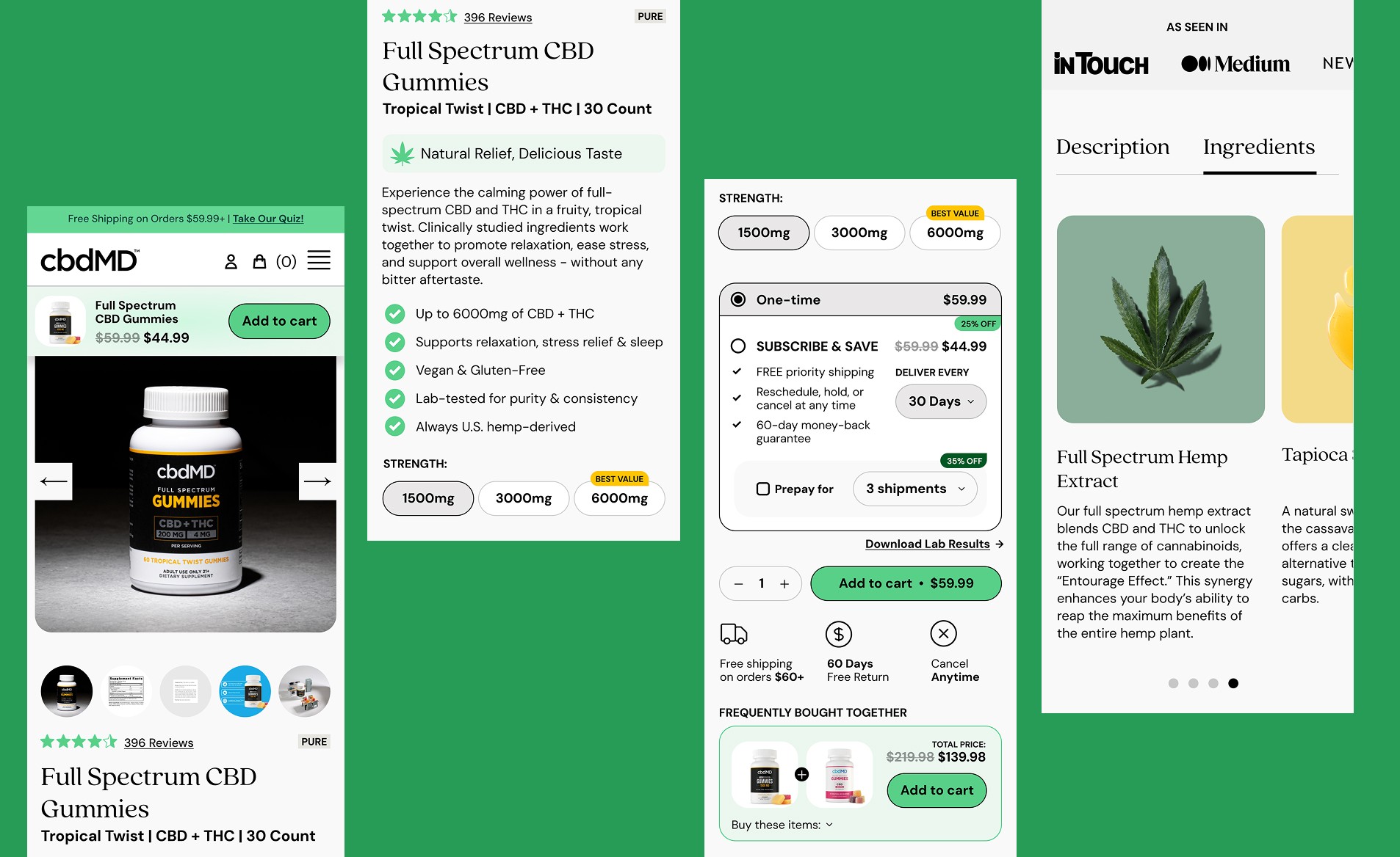
"The product formulation didn't change. The brand story didn't change. But the PDP went from generic CBD supplement to premium wellness brand with one strategic redesign. That's CBD branding that converts."
This case study demonstrates what I mean by strategic CBD branding: it's not about adding more elements—it's about organizing, prioritizing, and presenting what you already have in a way that builds trust and makes buying decisions effortless.
CASE STUDY #2: SlumberCBN - Deep Zzzs CBD CBN THC Gummies
Category: CBD Sleep Products
Project Scope: Landing page and PDP redesign completed for Kangaroo Agency
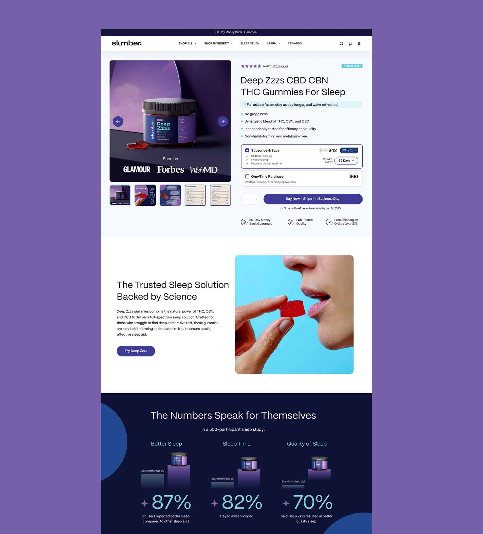
THE APPROACH: Science-Backed Sleep Positioning
Working with Kangaroo Agency on SlumberCBN, my goal was clear: make this feel like a premium sleep solution, not just another CBD product. The brand already had strong foundations—category-specific naming, sleep-appropriate color palette, and clinical backing. My job was to translate that into a PDP that builds trust and converts.
WHAT I DESIGNED:
1. HERO SECTION: Media Validation Front and Center
The hero section immediately establishes credibility with "Seen on Glamour, Forbes, WebMD" prominently displayed on the product image itself—not buried in a footer. This is strategic: if these major publications trust SlumberCBN, customers can too.
Key elements:
4.4 stars with 731 reviews positioned prominently for social proof
Clear benefit bullets with checkmarks (no groggy feeling, synergistic blend, independently tested, non-habit-forming)
Sleep-appropriate color scheme: Deep purples and navy blues that psychologically signal nighttime and rest
Product photography: Dark, moody lighting that reinforces the sleep category
2. SUBSCRIPTION DESIGN: Savings Impossible to Miss
The Subscribe & Save option shows $42 vs $60 one-time with "30% OFF" badge. This isn't buried—it's the first purchase option customers see. The pricing transparency builds trust: you're not hiding costs or tricking anyone into subscribing.
I also added delivery frequency selector (30 Days option shown) and clear benefits like "Pause or cancel anytime." This reduces purchase anxiety.
3. TRUST BADGE TRINITY
Below the CTA, three circular icons communicate instant credibility:
30-Day Money Back Guarantee
Lab-Tested Quality
Free Shipping on Orders Over $75
These aren't generic trust badges—they're specific to CBD customer concerns (Is it safe? Can I return it? What's the real cost?).
4. LIFESTYLE IMAGERY: Human Connection
The turquoise-background lifestyle shot shows someone about to take a red gummy. This is powerful because:
It's real photography, not stock or AI-generated templates
The bright turquoise contrasts with the dark purple product section, creating visual interest
Shows scale and usage—customers see exactly what they're buying
The red gummy pops against both the turquoise background and purple branding
5. SCIENTIFIC DATA VISUALIZATION: "The Numbers Speak for Themselves"
This section is where SlumberCBN separates itself from generic CBD brands. Instead of saying "helps you sleep," I designed a data section showing:
87% Better Sleep (compared to other sleep aids)
82% Sleep Time (stayed asleep longer)
70% Quality of Sleep (said Deep Zzzs resulted in better quality sleep)
Each stat includes:
Large, bold percentage in light blue/purple
Product image for brand reinforcement
Clear comparison context ("compared to other sleep aids")
Source credibility: "In a 500-participant sleep study"
The dark navy background with gradient creates a premium, scientific feel. This isn't marketing fluff—this is data-backed performance.
6. CATEGORY-SPECIFIC MESSAGING
The headline "The Trusted Sleep Solution Backed by Science" does triple duty:
Positions as sleep solution (not CBD product)
Emphasizes trust (critical for CBD)
Highlights science (differentiator from wellness woo-woo)
DESIGN DECISIONS THAT WORK:
Purple = Sleep Psychology
The deep purple and navy color scheme isn't accidental. These colors psychologically signal rest, night, and calm. Compare this to generic green CBD branding—SlumberCBN immediately communicates its category.
Media Logos on Product Image
Putting Glamour, Forbes, and WebMD directly on the hero product shot (not in a separate section) means customers see credibility at the exact moment they're evaluating whether to trust the brand.
Data Visualization Over Claims
Instead of "helps you sleep better," showing "87% of 500+ participants reported better sleep" provides concrete proof. The visual treatment makes the data scannable, not overwhelming.
Lifestyle Photography That Sells
The bright, modern lifestyle shot avoids the typical "person sleeping peacefully" cliché. It's vibrant, energetic photography that still reinforces the sleep use case.
WHAT THIS DEMONSTRATES:
When you have clinical data, make it visual.
SlumberCBN had a 500-participant sleep study—most CBD brands don't. I made sure that differentiator was impossible to miss with prominent, visual data presentation.
Category-first design works.
The purple/navy palette, nighttime imagery, and sleep-focused messaging position this as a sleep solution that happens to use CBD, not a CBD product that might help sleep. That distinction matters.
Trust signals need strategic positioning.
Media logos, review count, lab testing badges, money-back guarantee—all positioned where customers look during decision-making moments, not hidden in footers.
THE TAKEAWAY:
"When you have strong brand foundations and clinical backing, your PDP design should amplify those strengths—not bury them. SlumberCBN's science-backed positioning deserved science-backed visual treatment."
This case study shows what's possible when CBD branding meets strategic UX design: a PDP that builds trust, communicates value clearly, and positions the product in the right category.
Key Takeaways
The CBD Branding Playbook: 5 Non-Negotiables
If you take nothing else from this guide, implement these five principles:
✅ Category-First Design
Stop defaulting to green just because you're selling cannabis. Your CBD branding should communicate your category first, your ingredient second.
Sleep products → Calming colors (purple, navy, soft blues)
Energy products → Bold citrus palettes (orange, yellow, lime)
CBD skincare brands → Elevated spa aesthetic (terracotta, cream, soft pink)
CBD drink brands → Modern beverage codes (study Liquid Death, Olipop, not supplement brands)
The brands winning market share aren't the ones screaming "WE'RE CBD!"—they're the ones whispering "we're the best sleep aid" or "we're luxury skincare."
✅ Instant Clarity Beats Clever Copy
Your customer should be able to understand your product in three seconds:
Dosage visible and bold ("25mg CBD • 3mg THC")
Primary benefit stated clearly ("Fall asleep faster")
No hunting for what makes you different
Replace paragraphs with scannable benefits using icons:
😴 Fall Asleep Faster
🌙 Stay Asleep Longer
☀️ Wake Refreshed
Clever marketing copy is fun. Clear communication makes money.
✅ Trust Above the Fold
You're not Amazon. You don't get the benefit of the doubt. Your CBD branding must aggressively build trust, and that starts with putting your credibility signals where people actually look.
Trust elements that must be above the fold:
"Third-Party Tested" badge
Certificate of Analysis link
Relevant certifications (US Hemp Authority, organic, etc.)
Star rating with review count
Brands with trust signals positioned above the fold see 34% higher conversion rates than those hiding this information in the footer. Every customer who has to scroll to find your credibility is a customer who might bounce first.
✅ Mobile-First CBD Branding
70% of your traffic is on mobile. Maybe more. If your CBD website design doesn't convert on a 375px screen, you're losing the majority of potential customers.
Mobile-first means:
CBD brand logos work at 50px (for social ads and mobile headers)
PDP layouts are thumb-friendly
Text is readable without pinch-zooming
Images load fast (under 3 seconds)
"Add to Cart" button is always accessible
Test your site on your phone right now. Is it harder to use than your competitor's? That's where your customers are going.
✅ Shopify Optimization Matters
Default Shopify templates aren't built for CBD branding. They're built for t-shirts and mugs.
You need custom sections for:
Compliance statements (without killing the vibe)
Dosage information (prominent but not medical-looking)
Trust badges (above the fold, not in footer)
Certificate of Analysis links (accessible but not overwhelming)
Plus: Fast load times aren't optional. Every 1-second delay in page load time reduces conversions by 7%. Your CBD packaging design might be beautiful, but if your site is slow, no one sticks around to appreciate it.
The Bottom Line:
"Your CBD branding isn't competing with other CBD brands. You're competing with Glossier, Liquid Death, and every premium DTC brand your customers follow on Instagram."
Set your standards accordingly.
Get Your CBD Brand Audit
Want to see how your CBD branding scores on my 7-Point Framework?
I'll audit your Branding and Shopify store and show you exactly what's working, what's costing you sales, and how to fix it.
What You Get (100% Free):
✅ Your Brand Score (0-70 rating across all 7 points)
✅ Shopify PDP Analysis with before/after design showing how it can be improved
✅ 3 Quick Wins you can implement this week for immediate improvement
✅ Competitor Comparison showing how you stack up against the top 5 brands in your category
✅ Custom Recommendations specific to your product type (CBD drink brands, skincare, edibles, sleep, energy, etc.)
No catch. No sales call. Just actionable insights to improve your CBD branding.
I'll deliver your audit in 5 business days.
GET CBD BRAND AUDIT →
Already Know You Need a Redesign?
If you've seen enough and want to skip straight to transformation:
View Done-For-You Branding Services →
Or view portfolio, before-after designs and case studies:
Works Collection →
P.S. For Paid Ad Buyers
If you're spending $5K+ per month on Meta, Google, or TikTok ads, you can't afford a weak landing page.
I offer PDP A/B testing to find your highest-converting CBD website design. Let's maximize your ad spend ROI.
See Done-for-You Landing Page Design →

